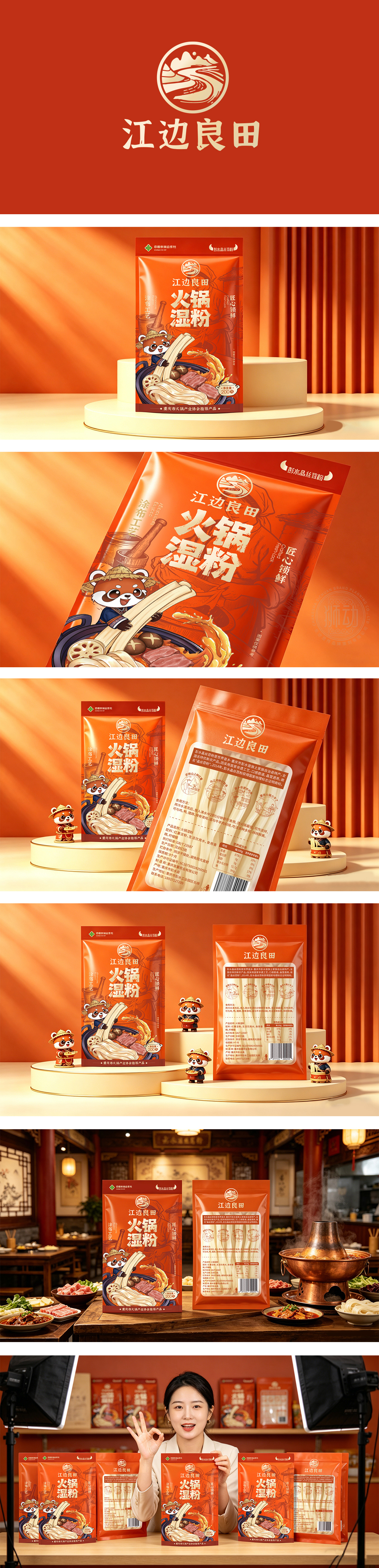
狮动设计采用鲜亮色彩,能够迅速刺激食欲,传达出“热辣”、“温暖”、“火锅”的心理暗示。这与产品的属性(火锅湿粉)高度契合。那只戴着草帽、抱着粉条的小熊猫(或是类似浣熊的卡通形象)非常抢眼。这个IP形象憨态可掬,增加了产品的亲和力,不仅打破了纯文字的单调,还赋予了品牌“原产地”、“天然”的联想(因为熊猫通常与四川/重庆的自然环境联系在一起)。“火锅湿粉”四个大字采用了粗犷、有力的书法字体,笔触带有飞白效果,传达出一种豪爽、正宗的江湖气息,非常符合重庆火锅的文化调性。而是在讲述一个关于“正宗、美味、可信赖”的故事。它成功地利用了色彩刺激食欲,利用IP增加趣味,利用插画展示美味,并利用权威背书建立信任,是一套非常成熟且具有销售力的视觉设计。
Lion design adopts the main color, which is very aggressive, can quickly stimulate the appetite and convey the psychological hints of "hot", "warm" and "hot pot". This is highly consistent with the product attributes (hot pot wet powder). The little panda wearing a straw hat and holding vermicelli (or a cartoon image similar to a raccoon) is very eye-catching. This IP image is naive, which increases the affinity of products, not only breaks the monotony of pure words, but also gives the brand the association of "origin" and "nature" (because pandas are usually associated with the natural environment in Sichuan/Chongqing). The four characters of "Hot Pot Wet Powder" adopt rough and powerful calligraphy fonts, and the strokes have the effect of flying white, conveying a bold and authentic Jianghu atmosphere, which is very in line with the cultural tonality of Chongqing hot pot. But telling a story about "authentic, delicious and trustworthy". It successfully uses color to stimulate appetite, IP to increase interest, illustrations to show delicacy, and authoritative endorsement to build trust. It is a very mature and marketable visual design.




扫码或拨打添加客服微信


