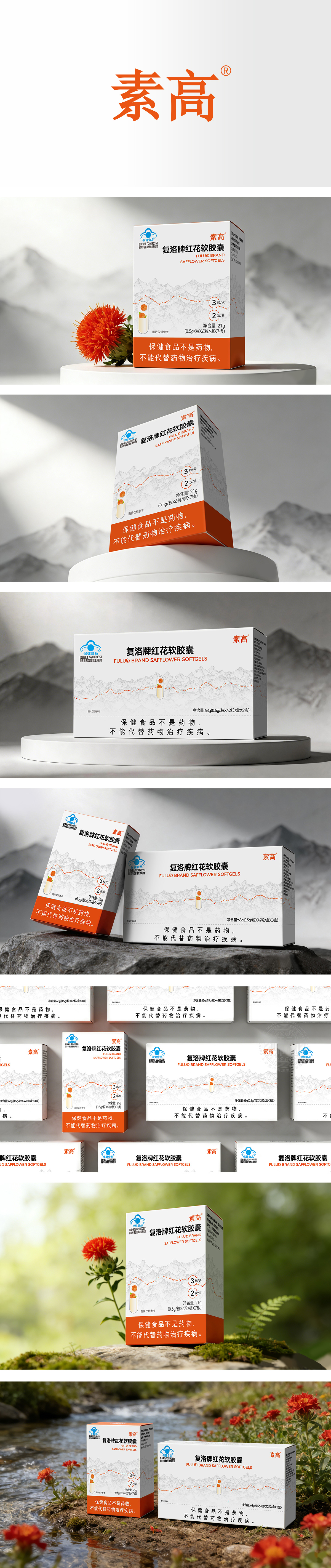
狮动设计以白色和橙色为主色调,搭配了淡雅的灰色山峦背景。橙色:作为点缀色,非常醒目,直接呼应了产品核心成分“红花”的颜色,充满活力,能迅速吸引消费者的目光。灰色山峦:背景中的水墨风格山峦线条,暗示了原料产地的纯净、天然,增添了东方美学意境,提升了产品的品质感。背景的山峦和中间的曲线图,则通过抽象的方式传递了“天然”和“功效”的概念,比单纯的文字描述更具说服力和艺术感。这款包装设计成功地将专业性、功能性与美学融为一体。它不仅美观,更重要的是,它高效地完成了信息传达的任务,让消费者在短时间内就能理解产品的核心价值和正确用法,是一款非常成熟和成功的商业设计。
lion design is dominated by white and orange, with an elegant gray mountain background. Orange: As a decorative color, it is very eye-catching, directly echoing the color of the core component of the product "safflower", full of vitality, and can quickly attract consumers' attention. Grey Mountains: The lines of mountains in the ink-wash style in the background imply the purity and naturalness of raw materials, which adds the artistic conception of oriental aesthetics and enhances the quality of products. The mountains in the background and the curves in the middle convey the concepts of "nature" and "efficacy" in an abstract way, which is more convincing and artistic than simple text description. This packaging design successfully integrates professionalism, functionality and aesthetics. It is not only beautiful, but more importantly, it completes the task of information transmission efficiently, so that consumers can understand the core value and correct usage of the product in a short time. It is a very mature and successful commercial design.




扫码或拨打添加客服微信


