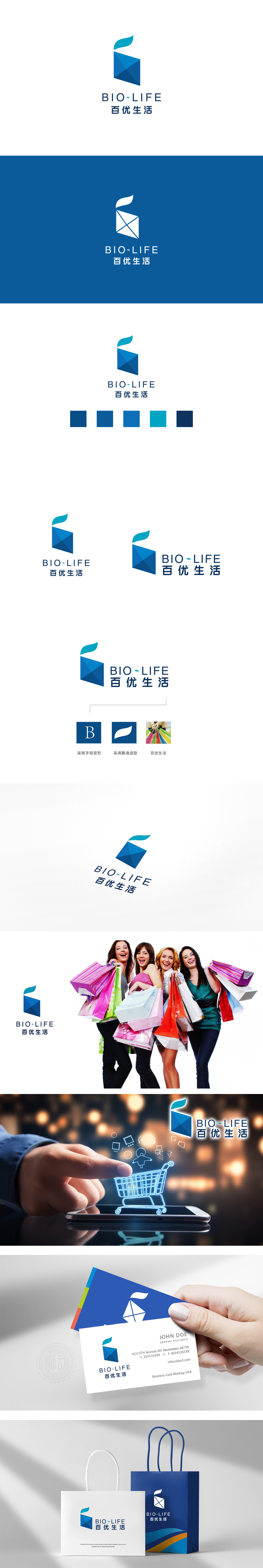
狮动设计以“结构化活力”构建商超场景联想,主体图形由深蓝三角形切割重组而成,呈现出稳定的“立体堆叠感”,既像百货商超中整齐排列的货架结构,也暗合商品分类陈列的秩序感,传递出“丰富、有序、可信赖”的商超核心属性。渐变层次则增加了图形的立体感和细节质感,暗示品牌在商品丰富度、服务深度上的“层次感”。色彩过渡自然无跳跃,象征商超与消费者生活的“无缝融入”。中文“百优生活”直白传递“优选百种商品,赋能优质生活”的品牌主张,“百”对应商超的商品丰富度,“优”强调品质筛选,用“结构化图形”解决商超的“商业属性表达”,用“流动感细节”赋予品牌“生活场景温度”。
Lion design constructs the scene association of supermarkets with "structural vitality", and the main graphics are cut and reorganized by dark blue triangles, showing a stable "three-dimensional stacking sense", which is not only like the neatly arranged shelf structure in department stores, but also coincides with the sense of order in the classified display of goods, conveying the core attributes of supermarkets that are "rich, orderly and reliable". The gradual gradation increases the three-dimensional sense and detailed texture of the graphics, suggesting the "layering" of the brand in terms of product richness and service depth. The color transition naturally has no jump.


扫码或拨打添加客服微信


