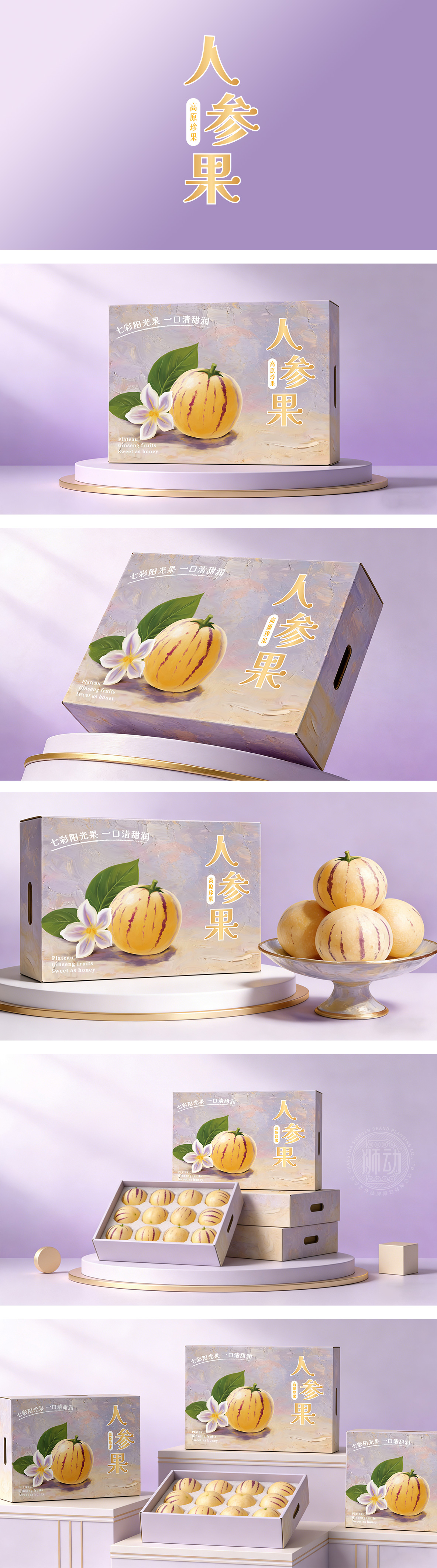
狮动设计采用厚涂油画的笔触纹理,配合淡紫色与米黄色的渐变,营造出一种“艺术感”和“高级感”。这种处理方式暗示了产品的稀缺性和高端定位,非常符合包装上“高原珍果”的文案设定。紫色通常代表神秘和高贵,而人参果本身的淡黄色属于暖色调。紫黄互补,既突出了主体果实,又让整体画面显得雅致,果实上的光泽感处理得非常细腻,高光点的位置暗示了果皮的薄与脆,让人联想到咬下去时“爆汁”的口感。它成功地将一种普通的水果,包装成了一份带有文化属性和审美价值的“高原礼物”。
Lion design adopts the brushwork texture of thick oil painting, with the gradual change of lavender and beige, creating an "artistic sense" and "advanced sense". This treatment implies the scarcity and high-end positioning of the product, which is very consistent with the copywriting setting of "plateau rare fruit" on the packaging. Purple usually represents mystery and nobility, while the pale yellow of ginseng fruit itself belongs to warm tone. The purple and yellow complement each other, which not only highlights the main fruit, but also makes the overall picture elegant. The gloss on the fruit is handled very delicately, and the position of high light spots suggests the thinness and crispness of the peel, which reminds people of the taste of "bursting juice" when biting. It successfully packaged an ordinary fruit into a "plateau gift" with cultural attributes and aesthetic value.




扫码或拨打添加客服微信


