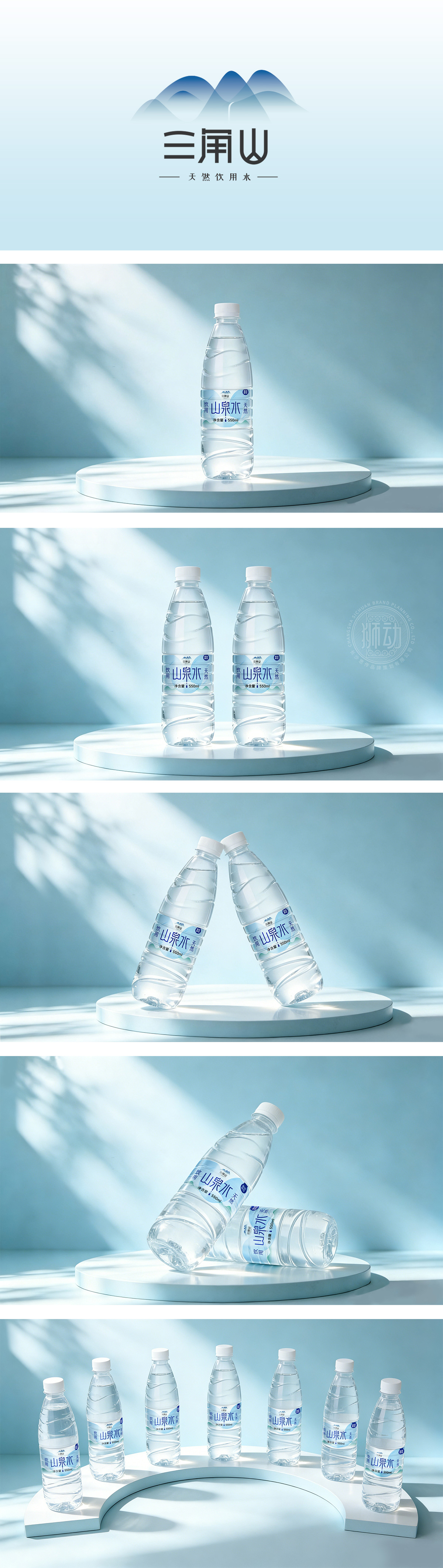
狮动设计采用大面积的留白,配合淡蓝色的水波纹和远山剪影,直观地呼应了“山泉水”的主题。“山泉水”三个字选用了具有书法感的字体,笔触苍劲有力,既传达了自然的野趣,又显得沉稳大气。副标题“饮用天然”则使用了清晰的无衬线字体,保证了阅读的易读性。通过“天然”、“山泉”等词汇,以及整体清新的视觉语言,设计成功地将产品与“健康”、“纯净”、“回归自然”的生活方式联系在一起,容易引发注重生活品质的消费者的共鸣。这是一款“以简驭繁”的设计。通过材质的质感、光影的运用和字体的考究,成功地将“水”这种最普通的商品,包装成了一个具有审美价值和情感温度的生活符号。
Lion design uses white and green as the main colors, white represents purity, and green symbolizes nature and vitality, which together build a fresh and healthy brand impression. The main title "Apple Jujube" uses a rough and powerful brush calligraphy font, which has great visual impact and cultural charm; The whole fruit and cut pulp are displayed on the packaging box, which intuitively shows the shape and texture of the product, so that consumers can see at a glance. This design successfully combines the natural attributes of the product with modern aesthetics, and conveys a high-end, healthy and quality brand image through simple visual language.




扫码或拨打添加客服微信


