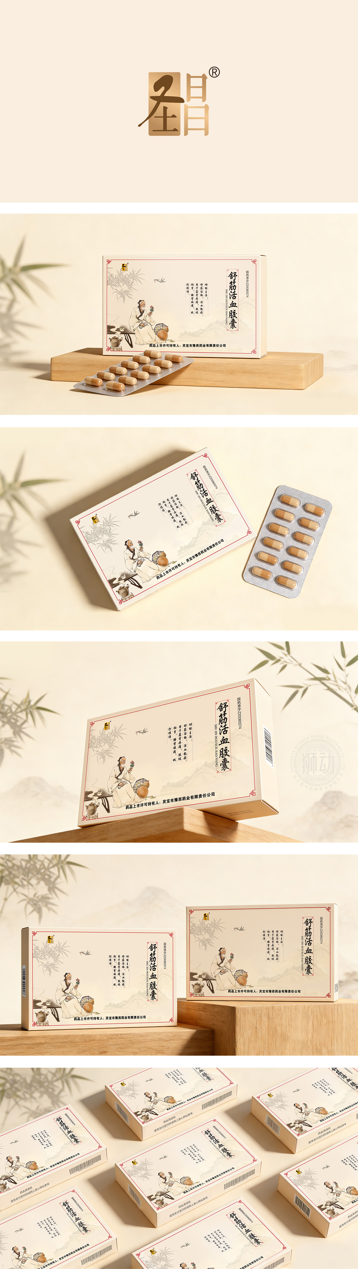
狮动设计采用中国传统水墨风格插画,描绘古代医者采药、品茗的场景,背景辅以远山、竹林、飞燕等元素,整体营造出“天人合一、自然疗愈”的东方养生意境。这种设计不仅契合中药“源于自然、调和身心”的产品属性,也强化了“传统医学智慧”的品牌联想,使消费者在视觉上产生信任感与文化认同。以竖排黑体字呈现,字体厚重有力,“圣昌”品牌标识采用红底黄字,配以传统回纹边框,既醒目又具辨识度。整体配色以米白、赭石、墨绿为主,辅以红色点缀,既符合中药产品的温和调性,又通过色彩对比提升视觉吸引力。包装盒边缘采用红色细线勾勒,呼应品牌标识,形成统一的视觉语言。
Lion design uses traditional ink-and-wash illustrations from China to depict the scene of ancient doctors picking herbs and tasting tea. The background is supplemented by distant mountains, bamboo forests, flying swallows and other elements, creating an oriental artistic conception of "harmony between man and nature and natural healing". This design not only conforms to the product attributes of traditional Chinese medicine "originating from nature and harmonizing body and mind", but also strengthens the brand association of "traditional medical wisdom", which makes consumers feel trust and cultural identity visually. Presented in vertical bold type, the font is heavy and powerful,The brand logo of "Shengchang" is marked with yellow characters on a red background and with traditional palindrome borders, which is both eye-catching and recognizable.




扫码或拨打添加客服微信


