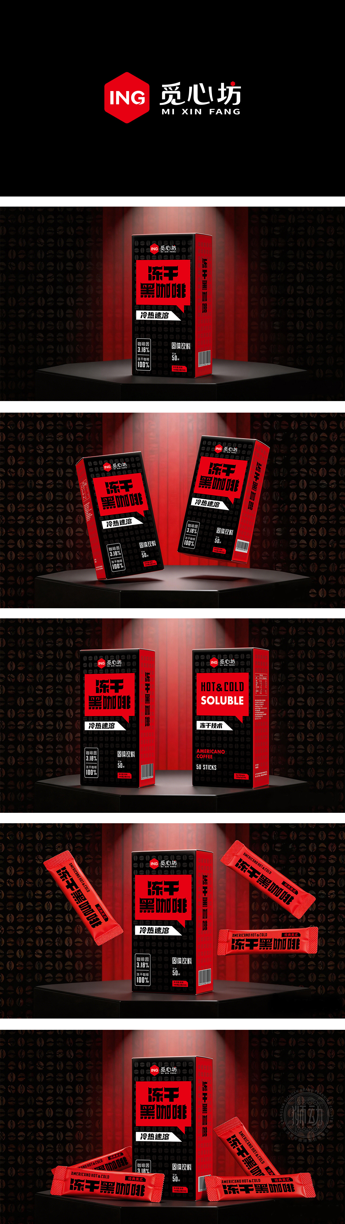
狮动设计采用高对比度的经典黑红搭配:黑色呼应咖啡品类属性,背景暗铺咖啡豆暗纹,既烘托品类氛围又不会抢主体重心;高饱和红色承载核心产品信息,醒目吸睛,不管线下货架陈列还是线上电商展示,都能第一时间抓取用户注意力,同时红黑搭配也传递出「提神、有活力」的心理暗示,完全契合黑咖啡的功能属性。整体用粗醒目的大字体设计,这种高对比+大字体的设计,既适合线下远观抓注意力,也适配电商主图、社交传播的小图阅读——哪怕在手机端小尺寸也能看清核心信息,完美适配现在多渠道销售传播的场景。这是非常成熟的快消品包装设计:完全服务于产品定位,信息传递和视觉吸引力都很到位。
Lion design adopts classic black and red with high contrast: Black echoes the coffee category attributes, and the background is covered with dark lines of coffee beans, which not only sets off the category atmosphere but also won't grab the main center of gravity; Highly saturated red carries the core product information, which is eye-catching. Whether it is displayed on the shelf offline or online e-commerce, it can grab the attention of users at the first time. At the same time, the combination of red and black also conveys the psychological hint of "refreshing and energetic", which fully fits the functional attributes of black coffee. As a whole, it is designed with bold and eye-catching large fonts. This high contrast+large font design is not only suitable for offline attention, but also suitable for reading the main picture of the power distributor and the small picture of social communication-even if it is small in size on the mobile phone, it can see the core information clearly, which perfectly adapts to the scene of multi-channel sales communication. This is a very mature packaging design of FMCG: it fully serves the product positioning, and the information transmission and visual appeal are in place.


扫码或拨打添加客服微信


