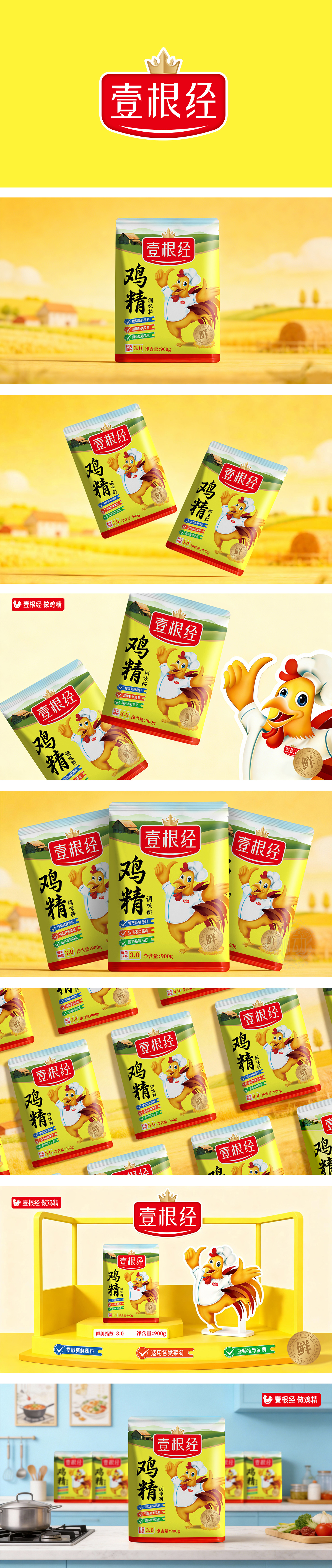
狮动设计采用“拟人化IP”建立强记忆,解决“货架识别难题”,包装的核心视觉是一只穿厨师服、做加油手势的公鸡——这个形象太妙了,圆眼睛、红鸡冠、翘尾巴的卡通风格,加上“比耶”“挥手”的动作,完全打破传统鸡精包装“生硬、工业化”的印象,反而像个“可爱的厨房伙伴”,让人看到就觉得“用它做饭会开心”;对于品牌来说,它是“能在货架上脱颖而出的符号”“能建立情感连接的IP”“能快速传递信任的工具”,设计把“卖鸡精”变成了"帮你做好饭的小伙伴’"——这就是好设计的力量。
Lion design uses "anthropomorphic IP" to build strong memory and solve the "shelf identification problem". The core vision of the packaging is a rooster wearing a chef's suit and gesturing for refueling. This image is wonderful. The cartoon style of round eyes, red cockscomb and cocky tail, together with the action of "Biye" and "waving", completely breaks the impression that the traditional chicken essence packaging is "stiff and industrialized", but it looks like. For the brand, it is a symbol that can stand out on the shelf, an IP that can establish emotional connection, and a tool that can quickly convey trust. The design turns "selling chicken essence" into "selling a small partner who can help you cook"-this is the power of good design.


扫码或拨打添加客服微信


