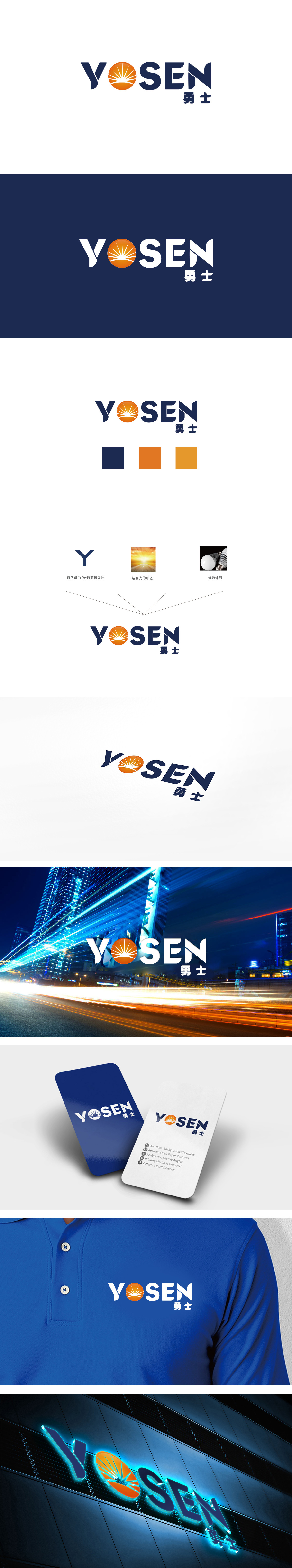
狮动设计采用放射线条从中心向外逐渐变细,形成“光芒扩散”的动态感,标志中央的「橙色太阳」是视觉焦点,既直观传递出「光明、温暖、活力」的积极联想,又暗合品牌名称“勇士”(YOSEN)所蕴含的“冲破黑暗、迎接挑战”的精神内核。整体通过“太阳(希望)+勇士(行动)”的符号组合,品牌成功将抽象的“勇气”转化为可感知的视觉语言:太阳提供“精神能量”,勇士代表“实践力量”,二者结合传递出“以勇气驱动行动,以光明照亮前路”的品牌主张。
Lion The design of Lion Motion uses radial lines to gradually taper from the center to the outside, forming a dynamic sense of "light diffusion". The "orange sun" in the center of the logo is the visual focus, which not only intuitively conveys the positive association of "light, warmth and vitality", but also coincides with the spiritual core of "breaking through the darkness and meeting challenges" contained in the brand name "YOSEN". As a whole, through the symbol combination of "sun (hope)+warrior (action)".


扫码或拨打添加客服微信


