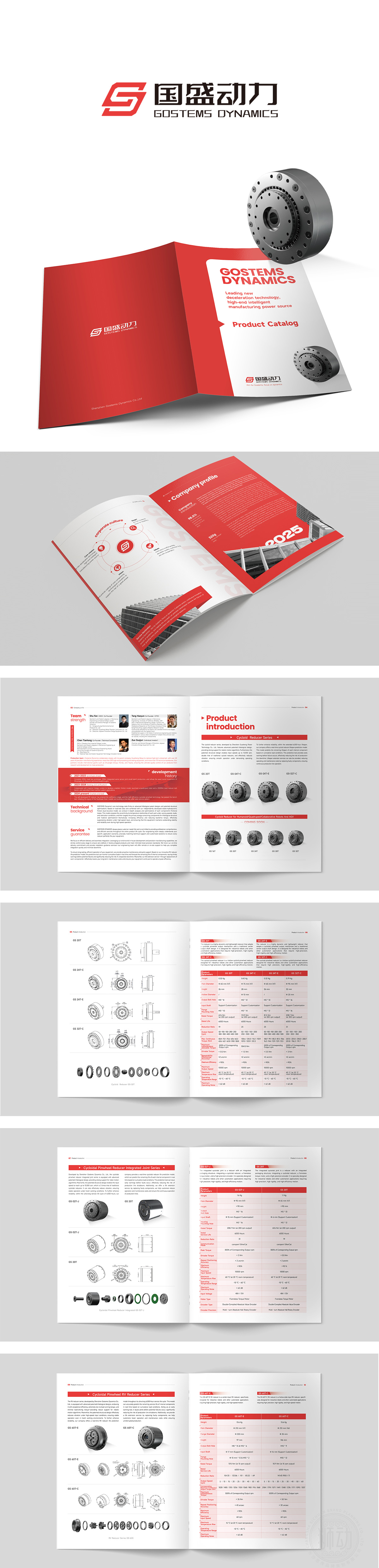
狮动设计以高饱和度红色为核心色调,搭配纯净白作为背景,形成强烈的视觉冲击。红色自带「活力、信任、权威」的心理暗示,完美契合企业;白色则平衡了红色的跳跃感,让整体风格更显专业、大气,不会让人产生视觉疲劳。每一个元素(颜色、布局、图形、文字)都在解决问题:用红色解决「企业形象记忆点」的问题;用图形化解决「企业文化难懂」的问题;用大数字解决「重点数据突出」的问题;用质感解决「品牌溢价」的问题。用视觉语言,帮企业「说话」。
Lion design takes high saturation red as the core tone and pure white as the background, forming a strong visual impact. Red has its own psychological hint of "vitality, trust and authority", which perfectly fits the enterprise; White balances the jumping feeling of red, making the overall style more professional and atmospheric, without causing visual fatigue. Every element (color, layout, graphics, text) is solving the problem: using red to solve the problem of "corporate image memory point"; Solve the problem of "corporate culture is difficult to understand" with graphics; Solve the problem of "outstanding key data" with big numbers; Solve the problem of "brand premium" with texture. Use visual language to help enterprises "speak".


扫码或拨打添加客服微信


