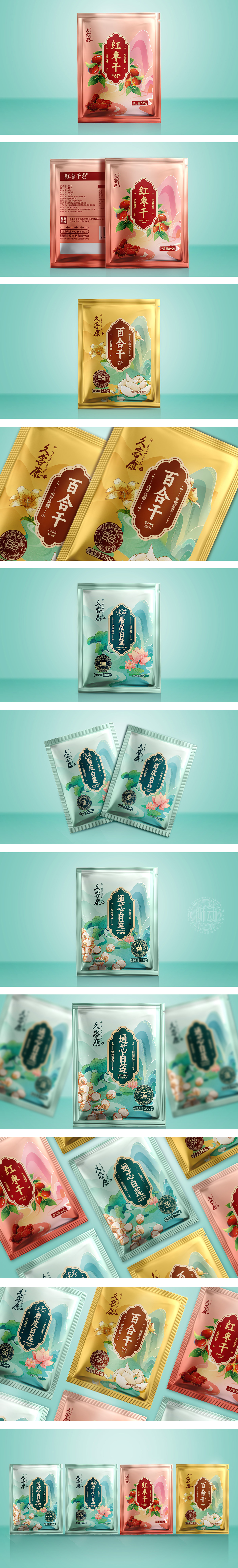
狮动设计主色调选用暖粉渐变背景,搭配红色标签,传递温暖、健康的产品属性(红色关联喜庆与滋补,粉色柔和易亲近)。绿叶插画与鲜枣实物图形成色彩对比,既突出自然原料,又通过明快色调激发食欲。图形符号与文化融合?,标签借鉴传统窗花造型,暗合“久客康”品牌的文化底蕴;背景流动线条抽象化山峦/丝带,隐喻产品源自自然与工艺传承,强化国潮风格,符合目标客群对传统滋补品的认知。
Lion Design adopts a warm powder gradient background with red labels to convey warm and healthy product attributes (red is associated with celebration and nourishing, and pink is soft and easy to get close to).The illustration of green leaves forms a color contrast with the physical picture of fresh dates, which not only highlights natural raw materials, but also stimulates appetite through bright colors.Graphic symbols are integrated with culture, and labels draw lessons from traditional window grillage modeling, which coincides with the cultural heritage of "Jiukekang" brand.


扫码或拨打添加客服微信


