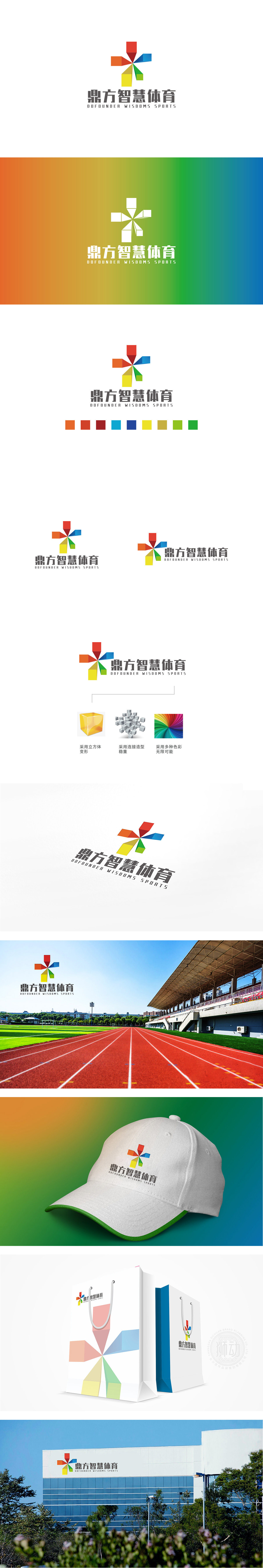
狮动设计以六个彩色立体方块为基本单元,围绕中心呈放射状对称排列,形成类似“星芒”或“齿轮”的聚合形态。每个方块采用不同角度的立体切割,通过阴影渐变增强空间感,打破平面设计的单调,传递出科技感与动态活力——这与“智慧体育”所强调的运动、创新属性高度契合。放射状结构同时蕴含“汇聚”与“辐射”两种张力:中心聚合:象征资源、技术、用户的整合;向外扩散:代表体育精神的传播、智慧科技的延伸,以及品牌辐射力的扩展。通过立体几何的动态聚合、多元色彩的象征隐喻、文字图形的协同统一,成功将“智慧体育”的科技属性、运动活力与品牌价值观可视化。
Lion design takes six colored cubes as the basic unit, which are arranged radially and symmetrically around the center, forming a polymerization form similar to "star awn" or "gear". Each square is cut from different angles to enhance the sense of space, break the monotony of graphic design, and convey the sense of science and technology and dynamic vitality, which is highly consistent with the sports and innovative attributes emphasized by "smart sports". Radial structure contains both "convergence" and "radiation" tensions: central aggregation: symbolizing the integration of resources, technology and users; Outward diffusion: it represents the spread of sports spirit, the extension of smart technology and the expansion of brand radiation.


扫码或拨打添加客服微信


