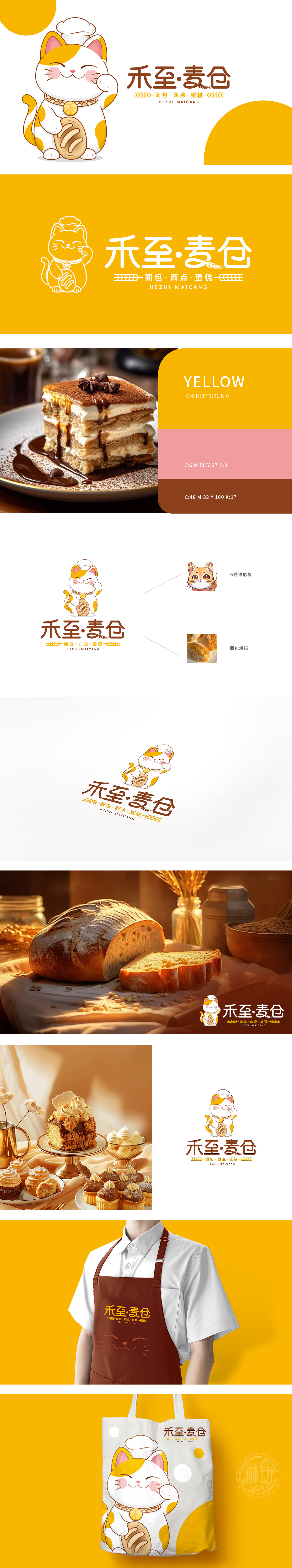
狮动设计采用戴厨师帽的猫,橙白相间的花色像刚烤好的面包,软fufu的;耳朵尖带点粉,眼睛圆得像两颗奶黄包,嘴角还微微翘着,活像个“藏着小秘密的烘焙师傅”~ 厨师帽直接点出“专业”,猫的形象又自带“亲和力”,瞬间就让人联想到“这家店的面包肯定像猫一样可爱,吃起来也暖乎乎的”!“禾”是粮食,“麦”是面包的原料,“仓”让人想起堆满面包的仓库,光看名字就觉得“这家店的面包肯定新鲜、实在”~ 字体用了有点像手写的笔触,边缘带点毛糙感,和猫的可爱风格完美融合,每一个元素都在“讲品牌的故事”:猫=可爱、温馨;厨师帽=专业;面包吊坠=产品;“禾至·麦仓”=新鲜、实在。这些元素加起来,刚好符合烘焙店“温暖、专业、有烟火气”的定位。
Liondesign adopts a cat wearing a chef's hat, with orange and white colors like freshly baked bread and soft fufu; The ears are a little pink, the eyes are round like two cream buns, and the corners of the mouth are slightly tilted, just like a "baker with a little secret" ~ the chef hat directly points out "professionalism", and the image of a cat has its own "affinity", which instantly reminds people that "the bread in this shop must be as cute as a cat and it tastes warm"! "Wo" is grain, "wheat" is the raw material of bread, and "Cang" reminds people of a warehouse full of bread. Just looking at the name, I feel that "the bread in this store must be fresh and real" ~ The font is a bit like handwriting, with a rough edge, which perfectly blends with the cute style of cats.


扫码或拨打添加客服微信


