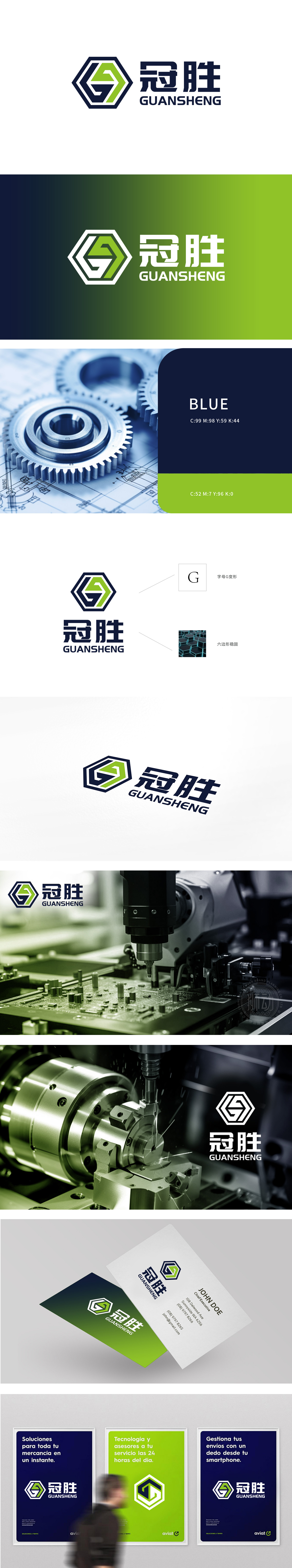
狮动设计采用六边形框架+内部绿色“G”形变形,每一处细节都在呼应五金电子科技的行业基因:六边形:作为五金、机械行业的“符号化形状”,天然传递稳定、严谨、工业质感,瞬间让观众联想到“硬件、制造、技术”等关键词,这是五金电子品牌最需要的“视觉信任状”;绿色“G”形:既是“冠胜”拼音首字母“G”的抽象化,更藏着双重行业隐喻,从形态看,像箭头(斜向上升的动势),传递“冠绝群雄、胜利前进”的品牌理念,从细节看,线条的棱角与分段像齿轮的一部分,暗示品牌在行业中的“驱动者”角色;“让用户一眼认出行业”和“让用户记住品牌差异”。
Lion design adopts hexagonal frame and green "G" shape inside, and every detail echoes the industry gene of hardware and electronic technology: hexagon: as a "symbolic shape" of hardware and machinery industry, it naturally conveys a stable, rigorous and industrial texture, instantly reminding the audience of keywords such as "hardware, manufacturing and technology", which is the "visual trust form" that hardware and electronic brands need most; Green "G" shape: it is not only the abstraction of the initial letter "G" of "Guansheng" pinyin, but also contains a double industry metaphor. From the form, it is like an arrow (obliquely rising momentum) to convey the brand concept of "winning the championship and advancing triumphantly". From the details, the edges and corners of the lines are like a part of a gear, suggesting the brand's "driver" role in the industry; "Let users recognize the industry at a glance" and "Let users remember the brand differences".


扫码或拨打添加客服微信


