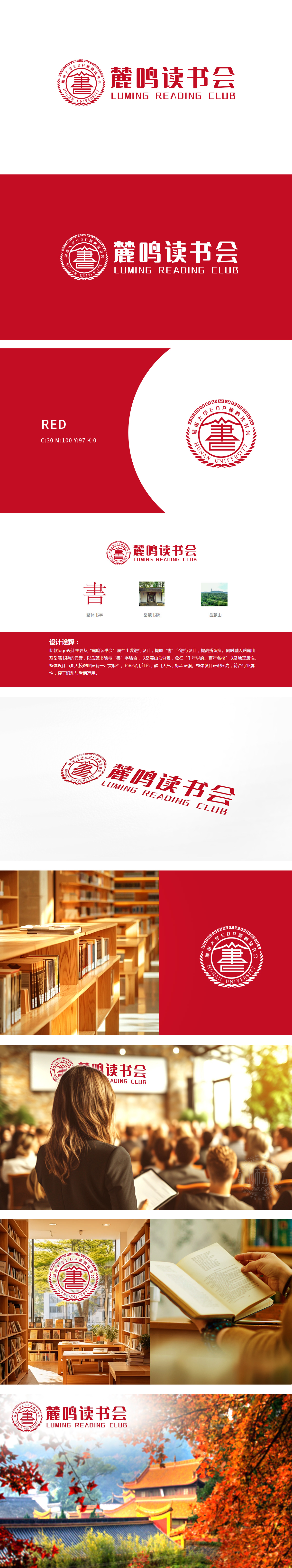
狮动设计以繁体“書”字为核心视觉符号,直接点明“读书会”的核心属性。字体采用书法风格的变形设计,笔画间的流畅感与印章式的外框结合,既保留了汉字的结构美感,又通过红色印章的形式强化了传统文化属性,传递出“读书如印刻于心”的意象,符合读书会的文化定位。“書”字上方的印章外框与内部群山,将“書”字与具体文化地标绑定,避免了抽象符号的模糊性。这种设计让观者能快速联想到“岳麓书院”这一千年学府的文化背景,强化了读书会与地域文化的关联,赋予品牌“底蕴深厚、传承经典”的气质。
Lion design takes the traditional word "book" as the core visual symbol, and directly points out the core attribute of "reading club". The font adopts the deformation design of calligraphy style, and the fluency between strokes is combined with the seal-like frame, which not only retains the structural beauty of Chinese characters, but also strengthens the traditional cultural attributes through the form of red seal, conveying the image of "reading is like being engraved on the heart", which is in line with the cultural orientation of the reading club. The outer frame of the seal above the word "book" and the internal mountains bind the word "book" to specific cultural landmarks.


扫码或拨打添加客服微信


