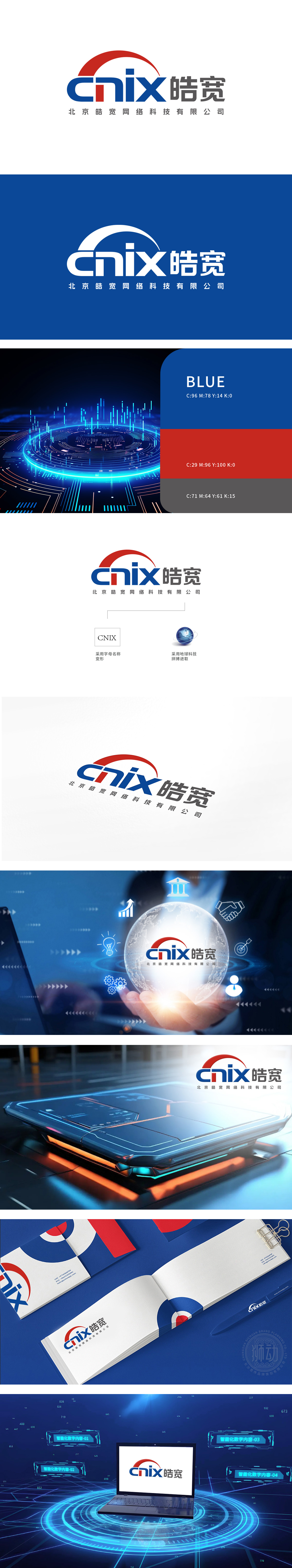
皓宽团队深度拆解其业务场景后,以红色半圆隐喻对客户需求的全维覆盖与活力服务属性,蓝红撞色字母强化科技辨识度与记忆点,搭配稳重汉字及企业全称,实现视觉层级与品牌信任力的双向渗透。新客户接触狮动时,多反馈该 logo“科技感与温度并存,瞬间感知专业度”。
After deeply disassembling its business scene, Haokuan team uses the red semicircle as a metaphor for the full-dimensional coverage of customer needs and the dynamic service attribute, the blue-red contrasting letters strengthen the scientific and technological recognition and memory points, and with the steady Chinese characters and the full name of the enterprise, it realizes the two-way penetration of visual hierarchy and brand trust. When new customers come into contact with Lion Motion.


扫码或拨打添加客服微信


