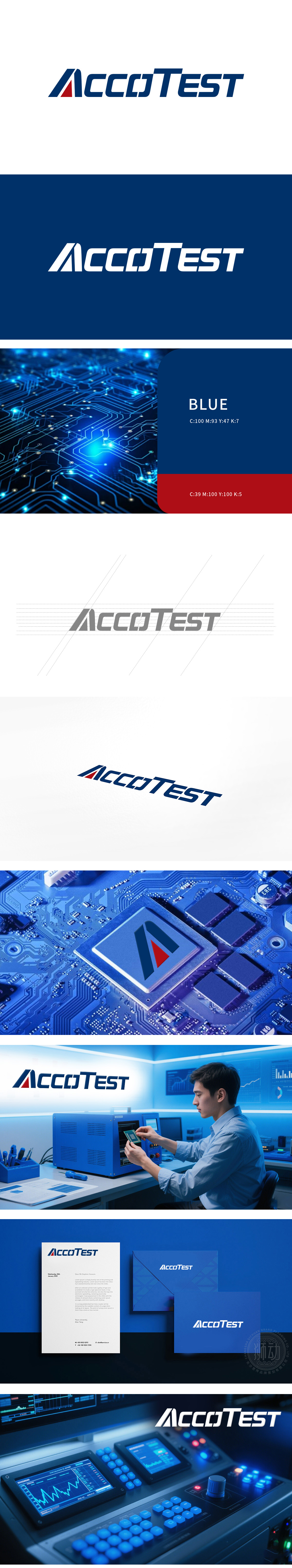
狮动为AccoTEST打造的LOGO设计,精准契合其芯片领域的专业属性。设计中以深蓝色为主色调,传递科技信赖感,字母“A”左侧的蓝红斜向装饰元素,象征精准测试与数据流动的动态创新。字体采用现代简洁风格,在强化品牌辨识度的同时,确保多场景应用适配性。成功助力其树立“专业、可靠、创新”的市场形象。
The LOGO design created by Lion Motion for AccoTEST fits the professional attributes of its chip field accurately. In the design, dark blue is the main color to convey the sense of scientific trust, and the blue-red oblique decorative element on the left side of the letter "A" symbolizes the dynamic innovation of precision testing and data flow. The font adopts modern and concise style, which strengthens brand recognition and ensures the adaptability f multi-scene applications. Success has helped it establish a "professional, reliable and innovative" market image.


扫码或拨打添加客服微信


