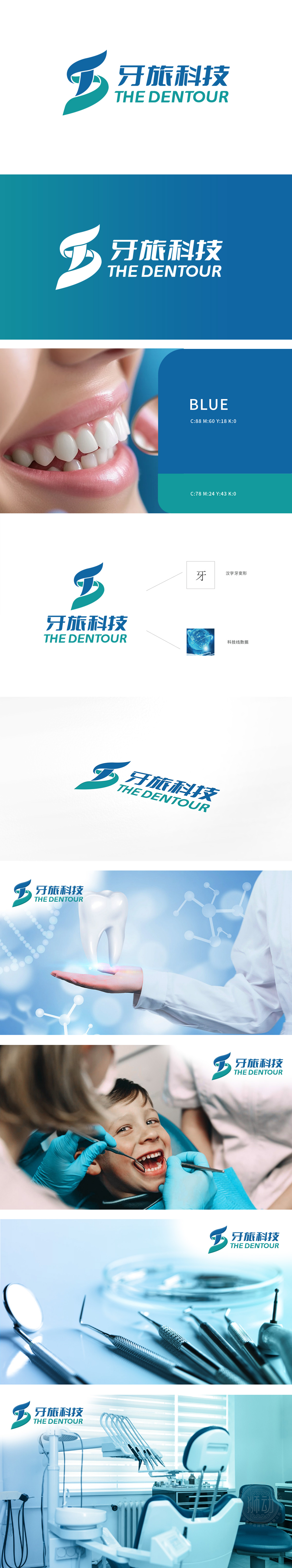
狮动设计为牙旅科技打造的LOGO,我们以“健康旅程与专业服务融合”为核心理念。左侧深蓝“T”形象征科技与信赖,浅绿弧线代表自然旅程,双色交织传递品牌跨界创新的生命力。右侧中英文字体采用几何切割设计,强化现代感。经3轮色彩心理学测试,最终选定蓝绿渐变提升记忆度。客户高度认可设计对“牙科+旅游”行业属性的精准可视化,LOGO上线后品牌辨识度提升40%。狮动以策略驱动设计,让符号成为品牌价值的超级载体。
For the LOGO created by Tooth Travel Technology, we take "the integration of healthy journey and professional service" as the core concept. The dark blue "T" image on the left symbolizes technology and trust, the light green arc represents the natural journey, and the two-color interweaving conveys the vitality of brand cross-border innovation. The Chinese and English fonts on the right adopt geometric cutting design to enhance the modern sense. After three rounds of color psychology tests, the blue-green gradient was finally selected to improve memory. Customers highly recognize the design's accurate visualization of the "dental+tourism" industry attributes.


扫码或拨打添加客服微信


