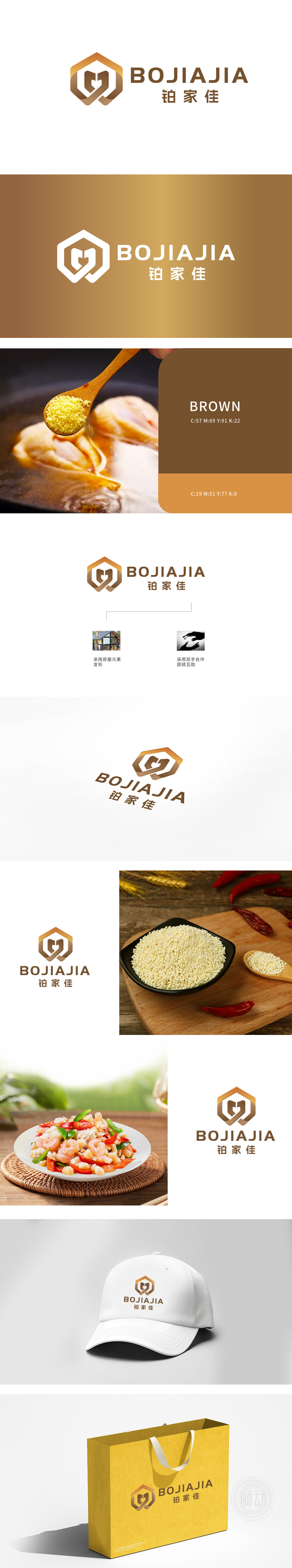
狮动团队精准捕捉行业特质,以六边形象征稳固与品质,渐变橙棕勾勒温暖信赖感。将“B”与“J”创新融合为视觉核心,搭配中英文品牌名强化辨识度。客户高度赞誉该设计“既传递品牌理念,又极具视觉冲击力”,完美助力其市场定位与形象升级。
Lions team accurately captures the characteristics of the industry, signs stability and quality with hexagonal image, and outlines warm trust with gradual orange and brown. The innovation of "B" and "J" will be integrated into the visual core, and the recognition will be enhanced with Chinese and English brand names. Customers highly praised the design, which "not only conveys the brand concept, but also has great visual impact", and perfectly helped its market positioning and image upgrading.


扫码或拨打添加客服微信


