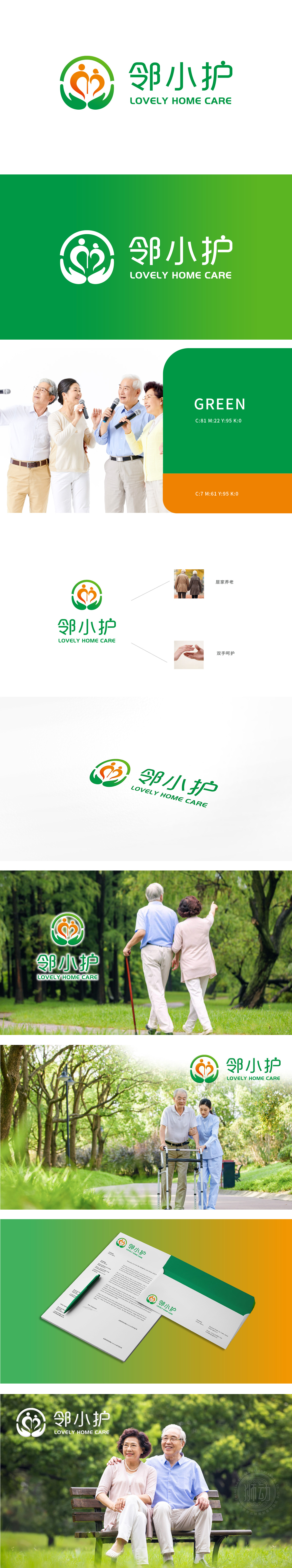
狮动深入调研后,以“温暖陪伴”为核心,创作“邻小护”LOGO:双人手形托举渐变人形,象征守护与成长;橙黄渐变传递活力,绿底注入安心感。字体选用圆润线条,强化亲切感。反馈“看到LOGO就感到被关怀”,品牌信任度显著提升,狮动以精准洞察与创意表达,让品牌价值可视化,助力社区养老服务深入人心。
Lion Dance created the LOGO of "Neighbourhood Care" with "warm companionship" as the core: two people holding hands to lift a gradual human figure, symbolizing guardianship and growth; The gradual change of orange and yellow conveys vitality, and the green background injects a sense of security. The font uses rounded lines to enhance intimacy. Feedback "I feel cared for when I see the LOGO", the brand trust has been significantly improved, and the lion moves to visualize the brand value with accurate insight and creative expression, helping the community pension service to be deeply rooted in the hearts of the people.


扫码或拨打添加客服微信


