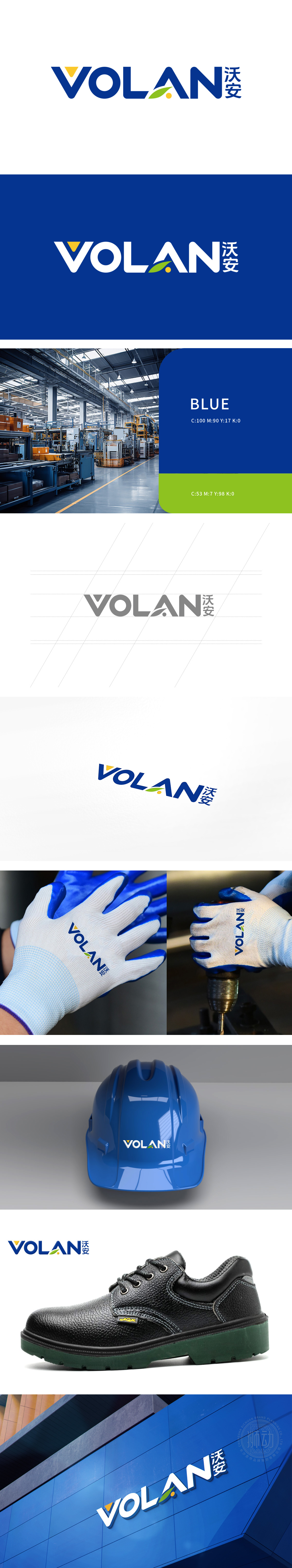
沃安是专注劳保用品领域的企业,委托狮动设计品牌LOGO 。狮动以深蓝展现专业可靠,黄色三角、绿色叶片融入安全活力感,字母线条利落且亲和,中英文字体呼应强化辨识度。新客户初见该LOGO,盛赞其把劳保安全承诺与创新服务凝于视觉符号,简洁有力传递“为劳动者筑安全屏障”的价值,对狮动精准把握行业特质与品牌气质的设计能力深表佩服。
Woan is an enterprise focusing on the field of labor insurance products, and entrusted Lion Motion to design the brand LOGO. Lion moves in deep blue to show professionalism and reliability, yellow triangles and green leaves are integrated with a sense of security and vitality, the letter lines are neat and friendly, and Chinese and English fonts echo to strengthen recognition. When new customers first saw the LOGO, they praised it for condensing labor safety commitment and innovative service into visual symbols, conveying the value of "building a safety barrier for workers" concisely and powerfully, and deeply admired Lion's design ability of accurately grasping industry characteristics and brand temperament.


扫码或拨打添加客服微信


