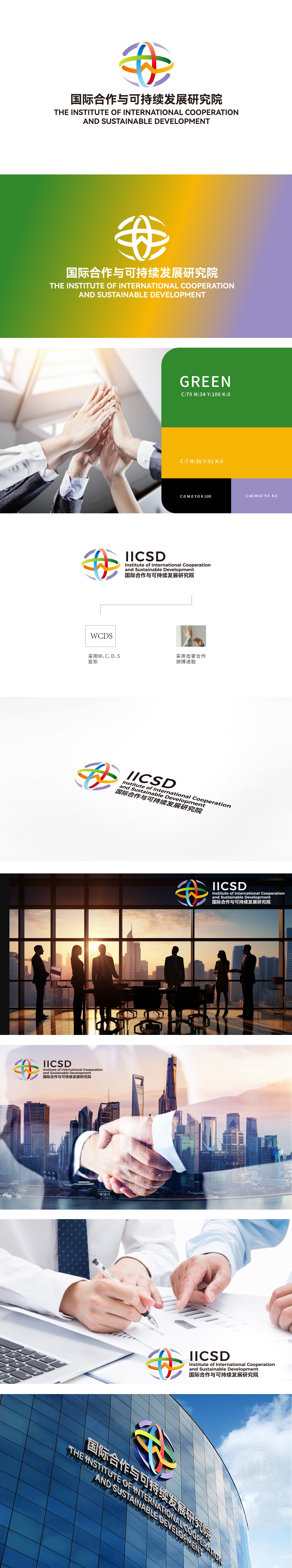
客户委托狮动设计“国际合作与可持续发展研究院”的LOGO。狮动团队深度解析品牌定位,以交织的彩色弧线构建核心视觉,象征多边协作与全球网络连接;原子结构形态隐喻科学创新,跃动色彩传递活力与可持续理念。方案精准融合国际视野与专业属性,客户高度评价设计“既抽象又具象,完美诠释品牌使命”,并主动推荐给行业伙伴,彰显狮动卓越的设计洞察力与创意表现力。
The customer entrusts Lion Motion to design the LOGO of "Institute of International Cooperation and Sustainable Development". The Lion Movement team deeply analyzes the brand positioning, and constructs the core vision with interwoven color arcs, symbolizing multilateral cooperation and global network connection; The atomic structure and morphology is a metaphor for scientific innovation, and colors convey vitality and sustainable ideas. The scheme accurately integrates international vision and professional attributes. Customers highly value the design as "both abstract and concrete, perfectly interpreting the brand mission", and actively recommend it to industry partners, demonstrating Lion Motion's outstanding design insight and creative expression.


扫码或拨打添加客服微信


