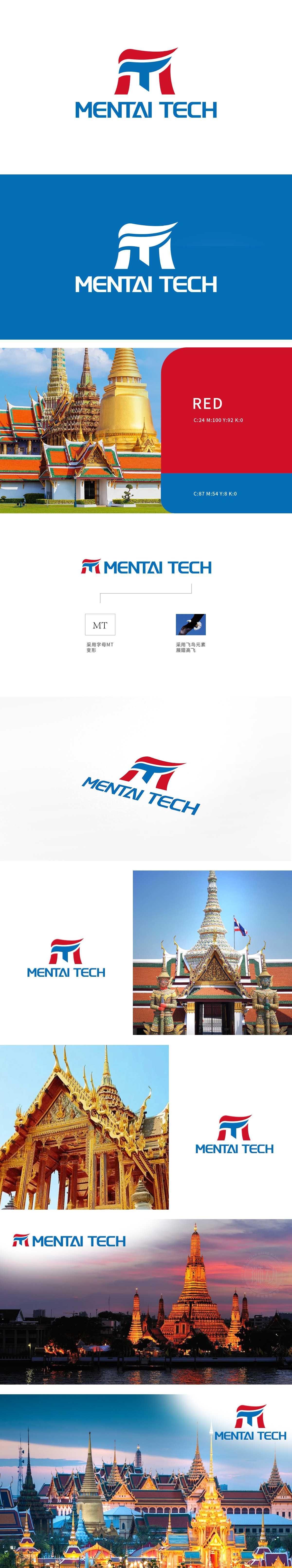
狮动设计打造的LOGO以红色与蓝色碰撞勾勒全球视野,流动的线条抽象化“M”与“T”字母,象征跨越地域的旅程连接。白色分隔线如通行世界的桥梁,简洁设计兼顾辨识度与国际化美感。品牌名称以科技感字体强化行业属性,整体传递“探索无界,旅行无疆”的理念。
The LOGO designed by Lion Motion outlines the global vision with the collision of red and blue, and the flowing lines abstract the letters "M" and "T", symbolizing the journey connection across regions. The white separation line is like a bridge to the world, and the simple design gives consideration to both recognition and international beauty. The brand name strengthens the industry attribute with a sense of science and technology font.


扫码或拨打添加客服微信


