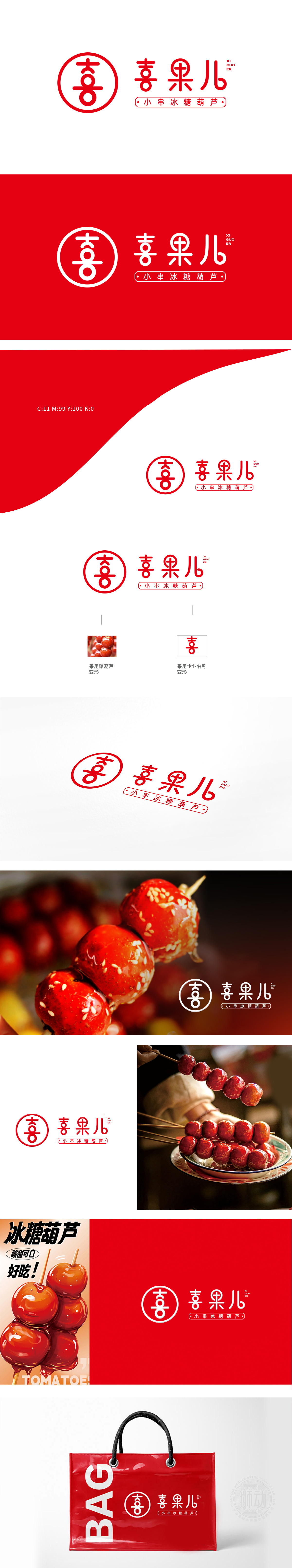
狮动以传统民俗符号为核:圆形印章包裹的“喜”字,传递冰糖葫芦的喜庆烟火气;主字体圆润灵动,贴合“小串”轻食属性;正红色系强化记忆点与美食联想。新客户探店时直言:“Logo把老行当做出新潮感,一眼记住还特有亲切劲儿!” 狮动用文化解构+年轻化表达,精准锚定品牌差异化,尽显设计对商业与情感的双向赋能。
The lion movement takes traditional folk symbols as the core: the word "Xi" wrapped in a round seal conveys the festive fireworks of Sugar-Coated Berry; The main font is round and smart, which fits the "small string" light food attribute; Positive red color system strengthens memory points and food association. When new customers visited the store, they bluntly said: "Logo makes the old business feel trendy, and it is unique to remember at a glance!" Lion uses cultural deconstruction+youthful expression to accurately anchor brand differentiation.


扫码或拨打添加客服微信


