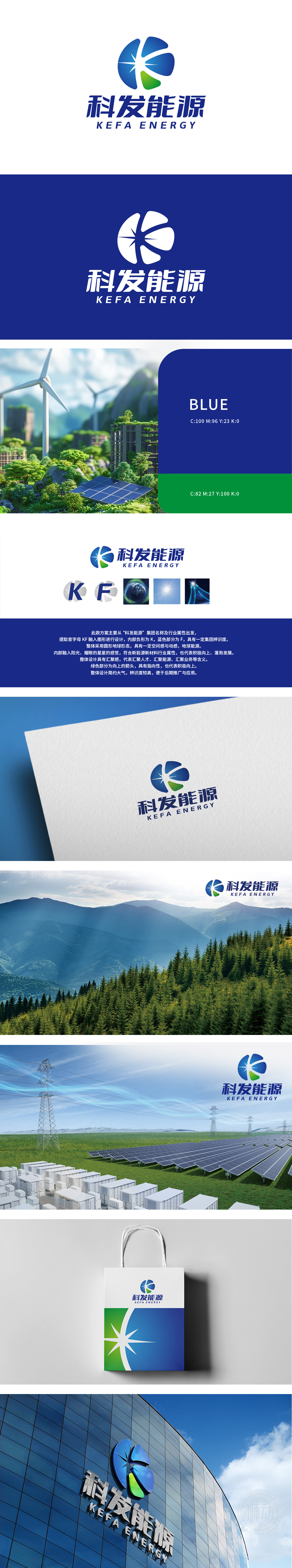
狮动设计为科发能源打造的LOGO,以“光”为核心视觉符号,融合新能源行业特质。蓝色半圆与花瓣造型象征科技与自然共生,绿色叶片凸显环保理念,中心星芒寓意光明与能量迸发。整体设计简洁现代,契合互联网时代审美,精准传递品牌核心价值。
The LOGO created by Lion Motion Design for Kefa Energy takes "light" as the core visual symbol and integrates the characteristics of new energy industry. The blue semicircle and petal shape symbolize the symbiosis between science and technology and nature, the green leaves highlight the concept of environmental protection, and the central star awn symbolizes light and energy generate.


扫码或拨打添加客服微信


