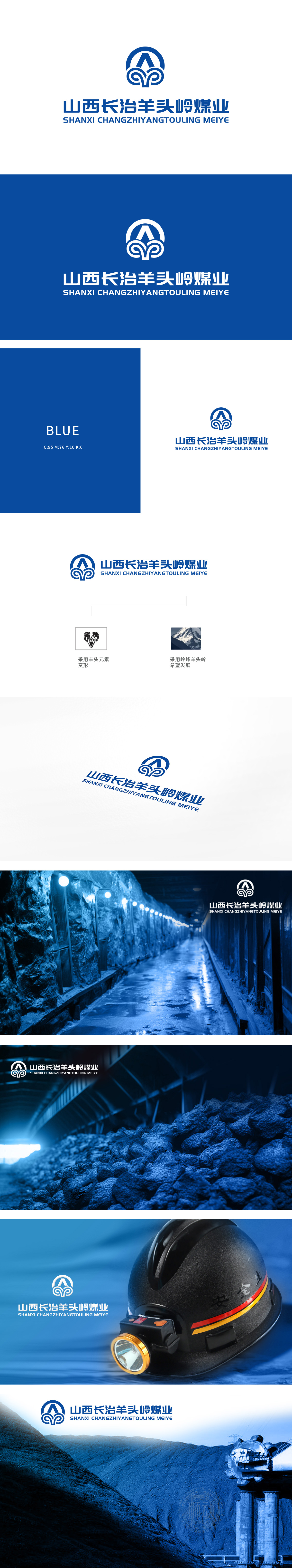
狮动设计充分考虑了煤矿行业的特点,通过山形和巷道的元素,直观地表达了公司的主营业务。Logo的图形部分采用了抽象的设计手法,整体形状类似于一个“山”字,象征着山西的地理特征和煤矿资源的丰富。同时,图形内部的线条流畅,形似矿井的巷道,寓意着煤矿开采的连贯性和安全性。设计者通过简洁的线条和几何形状,传达出企业的稳健和可靠。蓝色的选用象征着科技、专业和信任,符合煤矿行业的特点,通过精准的图形和色彩运用,成功传达了企业的核心价值。
Lion design fully considers the characteristics of coal mining industry, and intuitively expresses the company's main business through the elements of mountain shape and roadway. The graphic part of Logo adopts abstract design techniques, and its overall shape is similar to a word "mountain", which symbolizes the geographical characteristics of Shanxi and the rich coal resources. At the same time, the lines inside the figure are smooth, which looks like the roadway of a mine, implying the consistency and safety of coal mining. Designers convey the stability and reliability of the enterprise through simple lines and geometric shapes.


扫码或拨打添加客服微信


