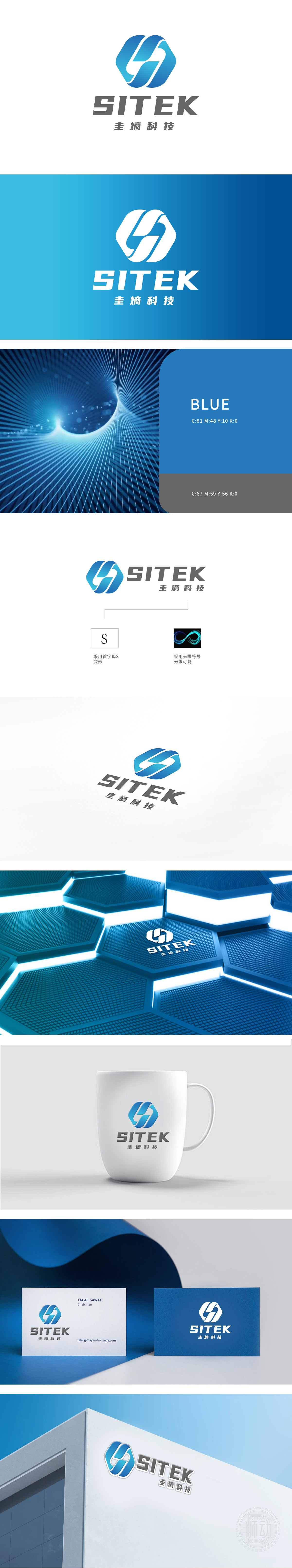
狮动设计采用Logo采用了抽象的双环设计,环形结构流畅且具有现代感,象征着连接、循环和无限的可能性。双环的交织设计,寓意着技术的融合与创新。使用了渐变的蓝色系,蓝色通常代表科技、信任和专业,渐变效果增加了视觉的层次感和动感,符合科技公司的定位。整体设计简洁而不失内涵,易于识别和记忆,符合现代品牌设计的趋势。
Lion design adopts Logo and adopts abstract double-ring design. The ring structure is smooth and modern, symbolizing connection, circulation and infinite possibilities. The interwoven design of double rings symbolizes the integration and innovation of technology. The gradient blue system is used, and blue usually represents technology, trust and professionalism. The gradient effect increases the visual layering and movement, which is in line with the positioning of technology companies.


扫码或拨打添加客服微信


