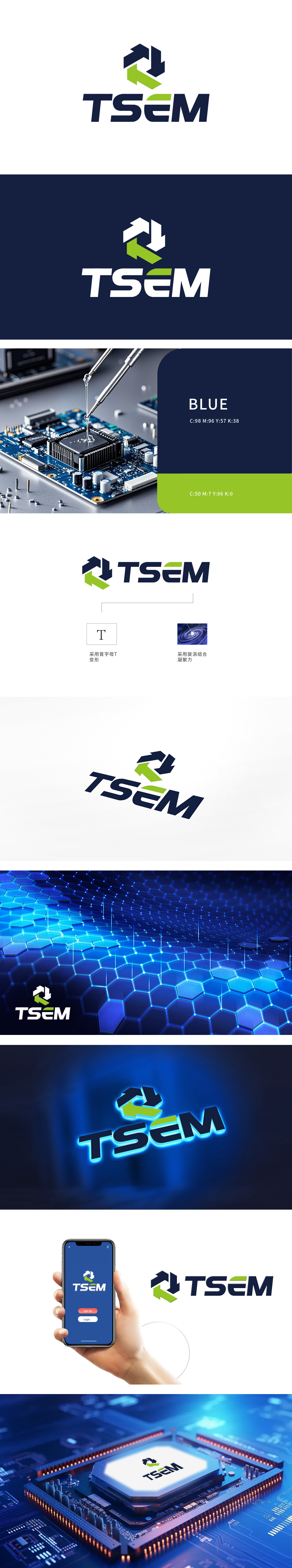
狮动设计以抽象化的「芯片电路板」为灵感,通过箭头构成的循环结构模拟电路网络的精密逻辑与高效互联。深蓝色箭头构建动态轨迹,象征技术流的持续运转;绿色箭头作为核心节点,以高饱和度点睛,隐喻「创新能量」的注入与突破。字母“E”的绿色横线设计,与图形系统形成色彩呼应,完成“形意合一”的视觉闭环。整体造型在极简中蕴含复杂性,传递品牌在专业领域深耕的理性与未来感。将抽象的科技概念转化为具象、易识别的品牌视觉资产。
Inspired by the abstract "chip circuit board", Lion Motion design simulates the precise logic and efficient interconnection of circuit networks through the circular structure composed of arrows. The dark blue arrow constructs a dynamic trajectory, symbolizing the continuous operation of technology flow; The green arrow is the core node, with high saturation as the finishing touch, which symbolizes the injection and breakthrough of "innovative energy". The green horizontal line design of the letter "E" forms a color echo with the graphic system and completes the visual closed loop of "unity of form and meaning".


扫码或拨打添加客服微信


