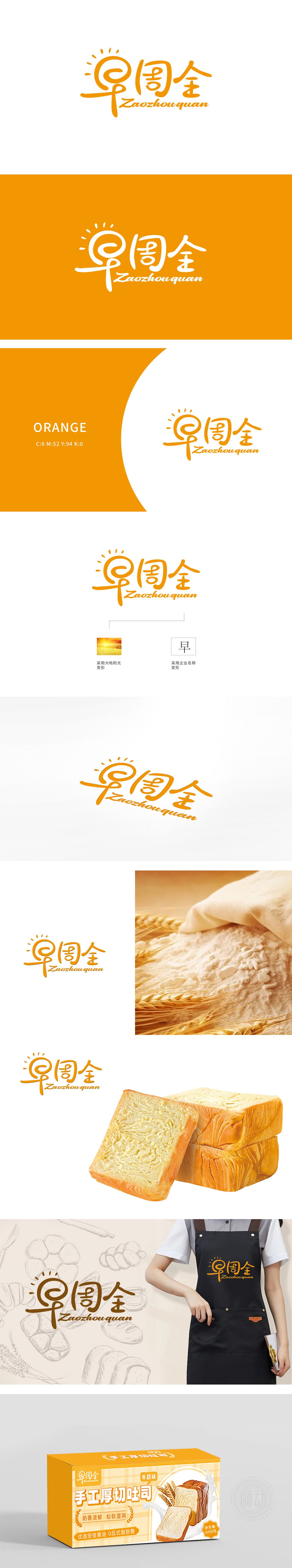
狮动设计采用了“早”字的变形设计,简洁而富有创意,强化了品牌识别度。整体设计既现代又不失传统韵味,易于记忆。晨曦与“早”字相呼应,联想到早餐场景,吐司作为常见早餐食品,进一步强化了这种联想。橙黄色调不仅视觉上吸引人,还寓意着热情、活力与丰收,符合企业积极向上的形象定位。将自然之美与品牌精神完美融合,为“早周全”赋予了独特的品牌魅力。无论是吐司的金黄酥脆,还是早餐的温暖惬意,都在这款Logo中得到了生动的诠释。
Lion design adopts the deformation design of the word "Zao", which is concise and creative, and strengthens the brand recognition. The overall design is both modern and traditional, and easy to remember. The word "morning" echoes the word "morning" and is associated with breakfast scenes. As a common breakfast food, toast further strengthens this association. The orange-yellow hue is not only visually attractive, but also implies enthusiasm, vitality and harvest, which is in line with the positive image positioning of the enterprise. The perfect combination of natural beauty and brand spirit endows "early and comprehensive" with unique brand charm.


扫码或拨打添加客服微信


