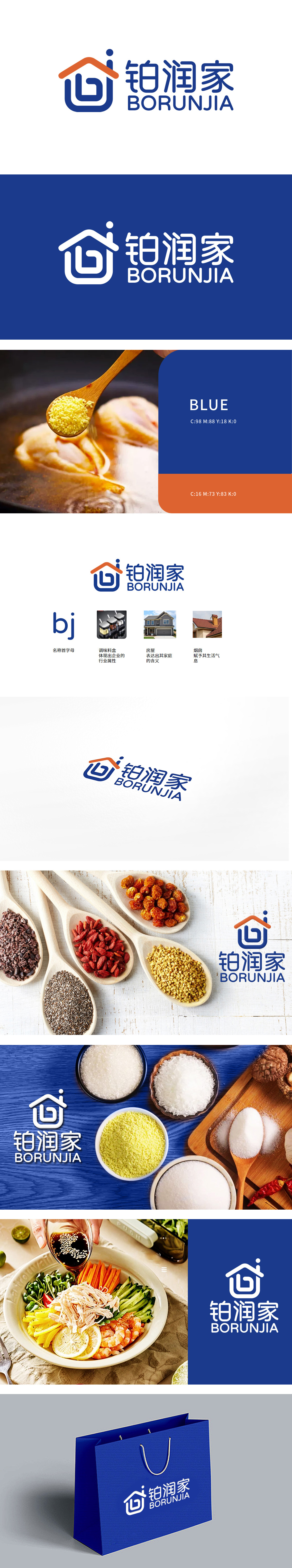
狮动采用了字母BJ变形,形似一个房子,传达出家庭和温馨的感觉。外形形似调料料盒,体现出企业与家庭厨房用品的紧密关联,强调了品牌的行业属性。颜色选择:橙色和蓝色的搭配,既温暖又专业,符合家庭用品的品牌定位。烟囱的细节设计,赋予品牌更多生活气息,使品牌形象更加贴近日常生活。整体设计结合家庭生活元素(如调料料盒、房屋、烟囱),不仅突显了“铂润家”品牌的行业属性和高品质,还成功地营造出温馨、实用的品牌形象。
Lion moves with the letter BJ, which looks like a house and conveys the feeling of family and warmth. Shaped like a seasoning box, it reflects the close relationship between enterprises and household kitchen supplies and emphasizes the industry attribute of the brand. Color selection: the combination of orange and blue is warm and professional, which conforms to the brand positioning of household products. The detailed design of the chimney gives the brand more life breath and makes the brand image closer to daily life.


扫码或拨打添加客服微信


