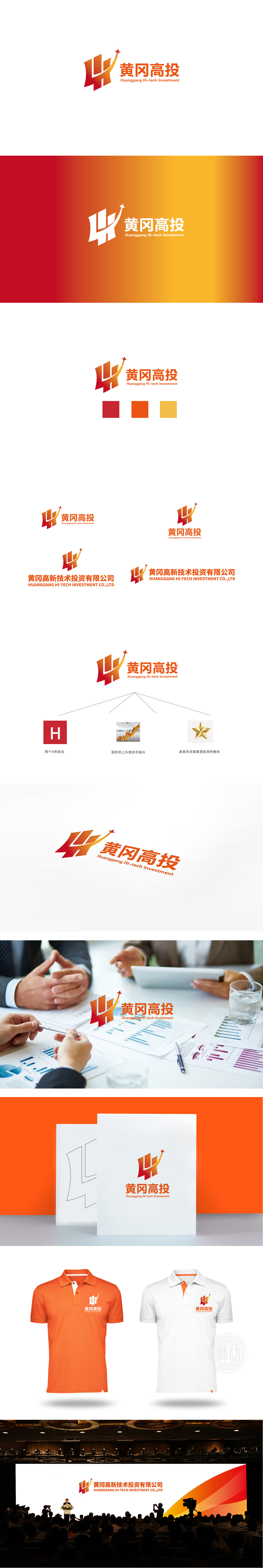
狮动设计采用HG”字母的具象化:几何化的切割方式,既强化了“投资机构”的专业感与结构性,又通过渐变色彩(从深红到亮橙)传递出“活力增长”的动态感——仿佛在暗示:黄冈高投作为“科技投资平台”,是支撑企业成长的坚实基础。箭头象征“成长、突破、向上”,星星则代表“目标、成功、行业引领”。两者的组合,用最直观的视觉语言诠释了“投资科技,成就未来”的品牌理念。整体用极简图形语言,将“地域属性、行业特征、企业使命”三者完美融合,既保留了投资机构的稳健感,又传递出高科技领域的活力与前瞻性。
Lion Design adopts the figuration of the letter HG: geometric cutting method, which not only strengthens the professionalism and structure of the "investment institution", but also conveys the dynamic sense of "vitality growth" through the gradual color (from deep red to bright orange)—as if implying that Huanggang Gaotou, as a "technology investment platform", is a solid foundation to support the growth of enterprises. The arrow symbolizes "growth, breakthrough and progress", while the star represents "goal, success and industry leading". The combination of the two explains the brand concept of "investing in technology and achieving the future" with the most intuitive visual language.


扫码或拨打添加客服微信


