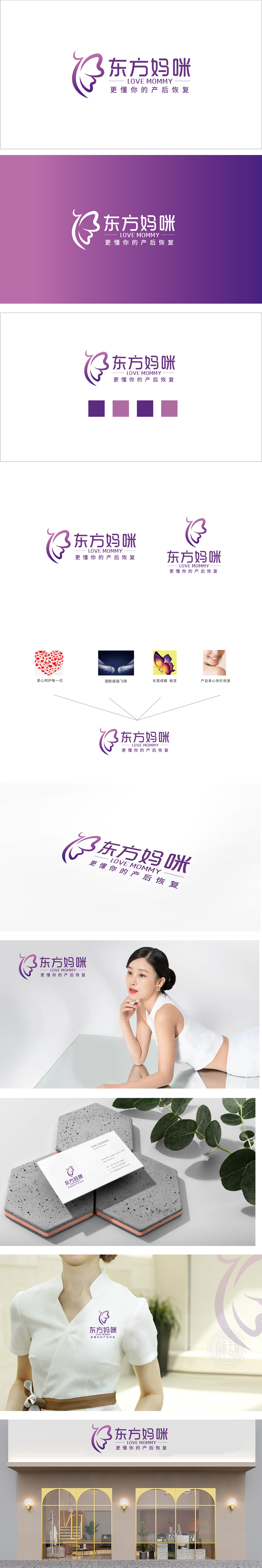
狮动设计采用化的女性头部轮廓,传递女性的温柔气质;曲线则模拟肩颈与上半身的轮廓,强化“产后妈妈”的身份认同。蝴蝶翅膀:蝴蝶的“破茧成蝶”是全球通用的“蜕变”符号,完美对应产后恢复的核心诉求——从产后的状态,恢复到更美好的自己,负空间的巧思:翅膀与侧脸之间的空隙,形成了“心”的轮廓,暗合“爱与关怀”的品牌温度。紫色是「温暖与专业」的平衡色,给人「柔和、安抚」的感觉,符合产后妈妈对“情绪支持”的需求;通过符号隐喻、文字质感、色彩逻辑的精准配合,把“产后恢复”的核心诉求(蜕变、专业、关怀)转化为可感知的视觉语言。
Lion design adopts the female head contour to convey the gentle temperament of women; The curve simulates the outline of the shoulder, neck and upper body, and strengthens the identity of "postpartum mother". Butterfly wings: Butterfly's "breaking cocoon into butterfly" is a universal symbol of "metamorphosis", which perfectly corresponds to the core appeal of postpartum recovery-from postpartum state to a better self, and the ingenious thinking of negative space: the gap between wings and side face forms the outline of "heart", which coincides with the brand temperature of "love and care". Purple is a balanced color of "warmth and professionalism".


扫码或拨打添加客服微信


