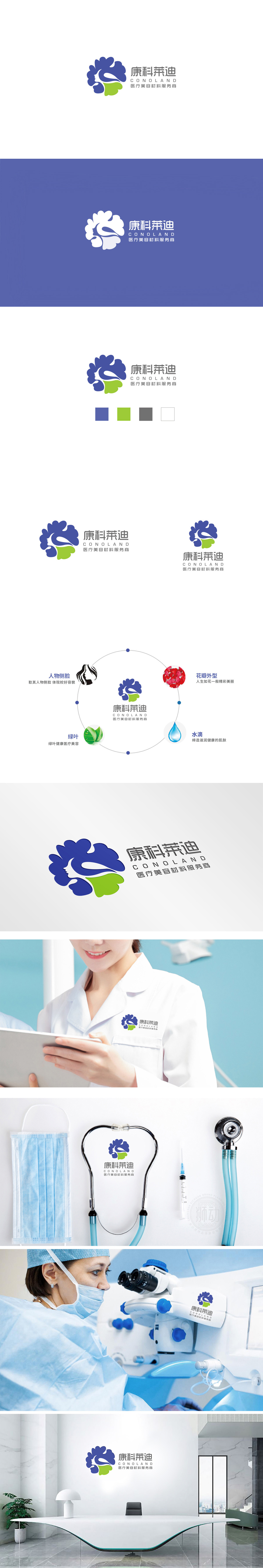
狮动设计采用抽象的花瓣造型,线条圆润流畅,既像绽放的花朵(象征“美丽”),又似包裹的护盾(暗示“保护”)。蓝色是医疗行业的经典配色,直接传递“专业、可靠”的信任感。 以极简的线条勾勒出女性侧脸轮廓,精准指向目标客群——女性。同时,白色象征“纯净、自然”,暗示品牌提供的材料能带来“天然美”的效果,绿色“基底”: 在花形底部加入一小片绿色,如同“根基”。绿色是自然、健康的象征,既呼应“医疗美容材料”的“安全性”,又传递“源于自然” “专业、安全、自然”的品牌内核。
Lion design adopts abstract petal shape, and the lines are round and smooth, which is like a blooming flower (symbolizing "beauty") and a wrapped shield (implying "protection"). Blue is a classic color matching in the medical industry, which directly conveys the trust of "professionalism and reliability". Draw the outline of women's side face with minimalist lines, and accurately point to the target customer group-women. At the same time, white symbolizes "purity and nature", suggesting that the materials provided by the brand can bring "natural beauty" effect, and green "base": a small piece of green is added to the bottom of the flower shape.


扫码或拨打添加客服微信


