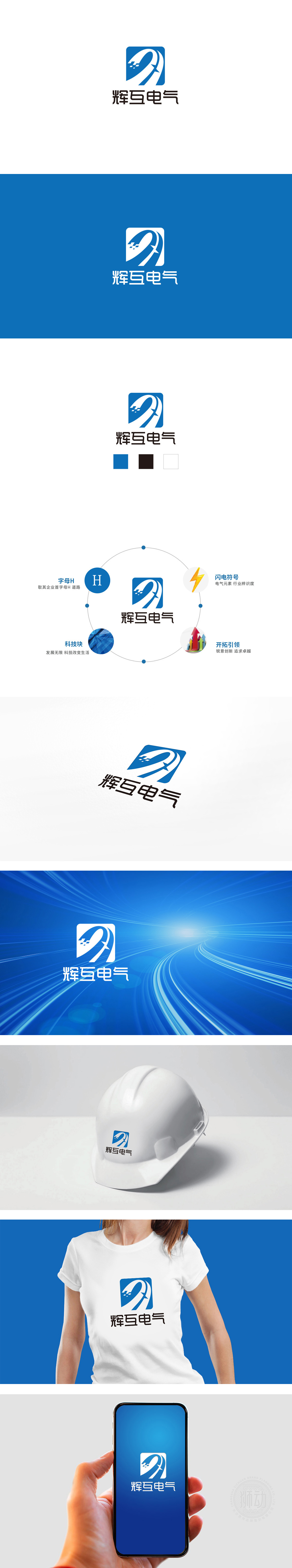
狮动设计采用方形结构,在视觉语言中象征「稳定、安全、可信赖」,完美契合电气行业对「安全冗余、边界可控」的核心要求,两条交错的白色曲线,形态类似「电流的流动轨迹」,既直观关联了「电气」的核心——「电」,又通过「流动感」暗示企业业务的「动态性」;整体风格简洁、现代,符合电气行业「专业、可靠、科技」的核心认知。
Lion Design uses a square to symbolize "stability, safety and reliability" in visual language, which perfectly meets the core requirements of the electrical industry for "safety redundancy and controllable boundary". Two interlaced white curves are similar in shape to "current flow trajectory", which not only intuitively relates the core of "electricity" but also implies the "dynamic" of enterprise business through "mobility". The overall style is concise and modern, which conforms to the core cognition of "professionalism, reliability and technology" in the electrical industry.


扫码或拨打添加客服微信


