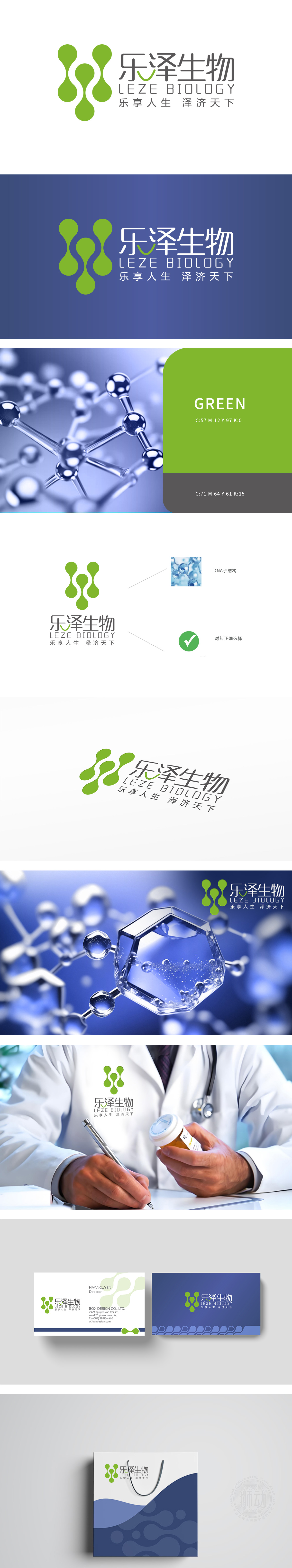
狮动设计由相互连接的圆形图案组成,象征着细胞或分子结构,传达出生物科技的主题,”“生命科学”的行业属性,绿色作为主色调,象征生命、健康、自然与科技的融合,符合医疗行业传递“安全、可靠、关怀”的视觉语言。整体设计以DNA双螺旋为核心视觉,融合绿色渐变与动态水滴元素,精准传达生物科技的前沿性与生命活力。
Lion design is composed of interconnected circular patterns, symbolizing cell or molecular structure and conveying the theme of biotechnology. "Life science" is an industry attribute, and green is the main color, symbolizing the integration of life, health, nature and technology, which conforms to the visual language of "safety, reliability and care" conveyed by the medical industry. The overall design takes DNA double helix as the core vision, and integrates green gradient and dynamic water drop elements to accurately convey the frontier and vitality of biotechnology.


扫码或拨打添加客服微信


