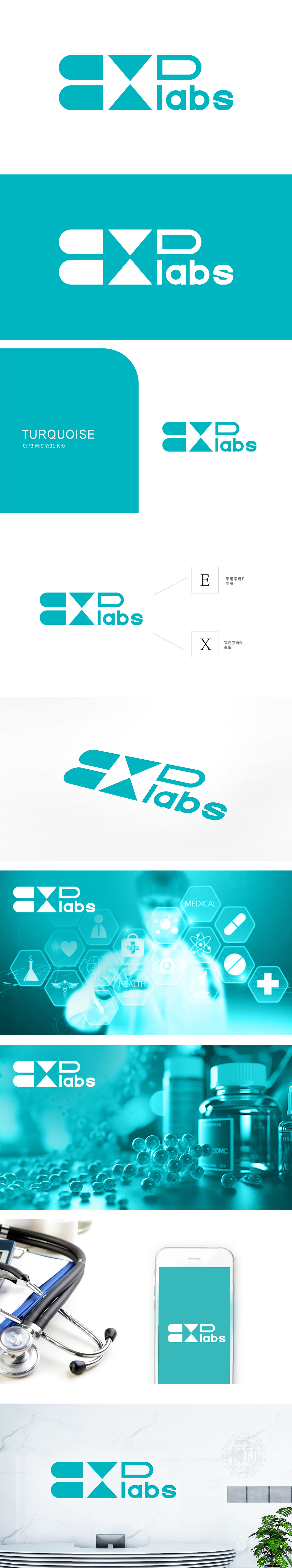
狮动设计通过两个对称的三角形交叉构成,线条简洁锐利,既是字母“X”的抽象化呈现,又暗合医疗场景中交叉检测”“精准定位”“多维度分析”的逻辑,三角形的稳定结构与交叉形态,也象征实验室研究中“科学严谨”与“突破创新”的双重特质,强化“EX labs”在医疗技术领域的专业定位。主色调青蓝色,具有冷静、理性、专业的视觉联想,传递“精准检测”“安全可靠”的品牌形象,整体通过字母E、X的抽象变形与医疗行业视觉符号的隐喻设计,传递专业、精准与创新的品牌气质。
Lion design is composed of two symmetrical triangles crossing, and the lines are concise and sharp. It is not only the abstract presentation of the letter "X", but also the logic of cross detection, accurate positioning and multi-dimensional analysis in medical scenes. The stable structure and cross shape of the triangles also symbolize the dual characteristics of "scientific rigor" and "breakthrough and innovation" in laboratory research, and strengthen the professional positioning of "EX labs" in the field of medical technology.


扫码或拨打添加客服微信


