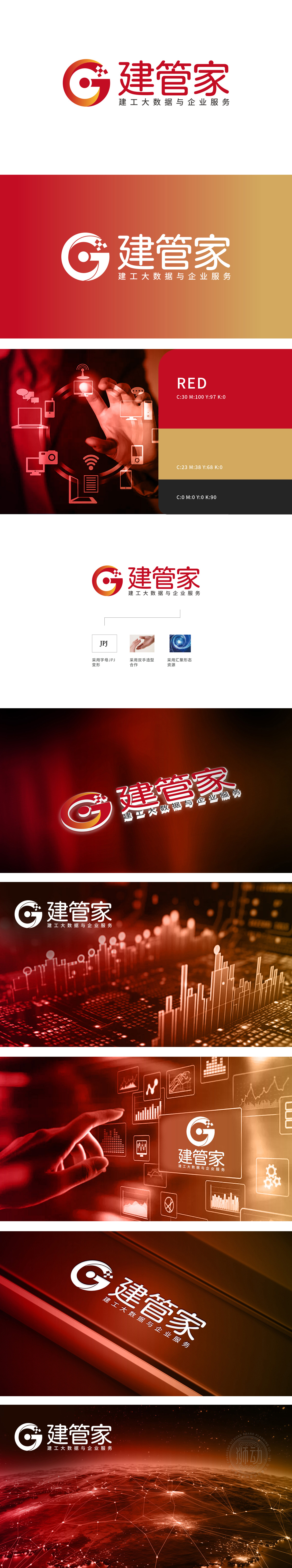
狮动设计以红色为主色调的环形设计,内嵌抽象化的“G”字母造型,环形象征循环、整合与全面性,呼应“管家”的全方位服务属性;同时环形包裹“G”,体现对建工领域的专注与专业守护。从红色到橙色的暖色调搭配,既传递活力、创新的品牌气质,“G”字母内侧的红色圆点,不仅平衡了图形的视觉重心,更象征核心、精准与数据中心,强化“大数据”的技术属性,寓意建管家以数据为核心驱动,为客户提供精准高效的服务。整体“G”字母、环形整合感、棋盘格元素,分别从“管理(G)”“全面服务(环形)”“工程数据化(棋盘格)”三个维度,精准映射品牌在“建工领域+大数据服务”的双重定位,既体现传统行业的稳重,又突出科技驱动的创新能力。
Lion design is a circular design with red as the main tone, embedded with abstract "G" letter modeling, which symbolizes circulation, integration and comprehensiveness, echoing the all-round service attribute of "housekeeper"; At the same time, the ring package "G" reflects the focus and professional protection in the field of construction engineering. The warm colors from red to orange not only convey the dynamic and innovative brand temperament, but also the red dot inside the letter "G" not only balances the visual center of graphics, but also symbolizes the core, accuracy and data center, and strengthens the technical attributes of "big data.which means that the housekeeper is driven by data and provides accurate and efficient services to customers. The overall "G" letter, circular sense of integration and checkerboard elements accurately map the dual positioning of the brand .


扫码或拨打添加客服微信


