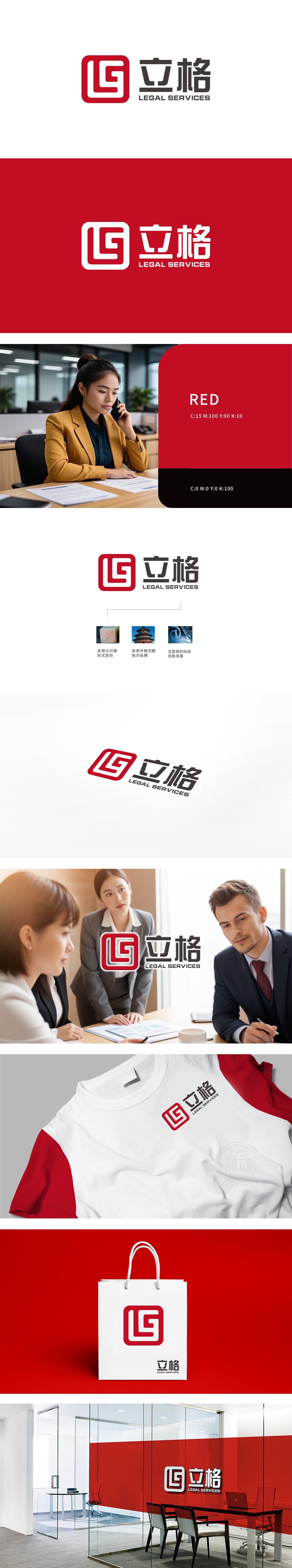
立格委托狮动打造品牌标识时,狮动以“法律属性+品牌记忆”双维度破局:取传统印章方正形制承载行业权威,将“LG”字母符号化嵌入,红调传递信任温度;搭配现代黑体字锚定专业感,让“立格”二字辨识度拉满,LOGO既延续法律领域严谨底色,又用创新视觉重塑记忆点,助力品牌在竞争中快速抢占客户心智——这正是狮动「懂行业更懂传播」设计力的具象呈现,为企业定制专属品牌符号。
When Lige entrusted Lion Movement to create a brand identity, Lion Movement broke the rules in two dimensions of "legal attribute+brand memory": taking the traditional seal square to bear the authority of the industry, symbolically embedding the letters "L" and "G", and transmitting the trust temperature in red tones; With the modern bold type, the sense of professionalism is anchored, and the recognition of the word "Lige" is full. LOGO not only continues the rigorous background in the legal field, but also reshapes the memory point with innovative vision, helping the brand to quickly seize the customer's mind in the competition.


扫码或拨打添加客服微信


