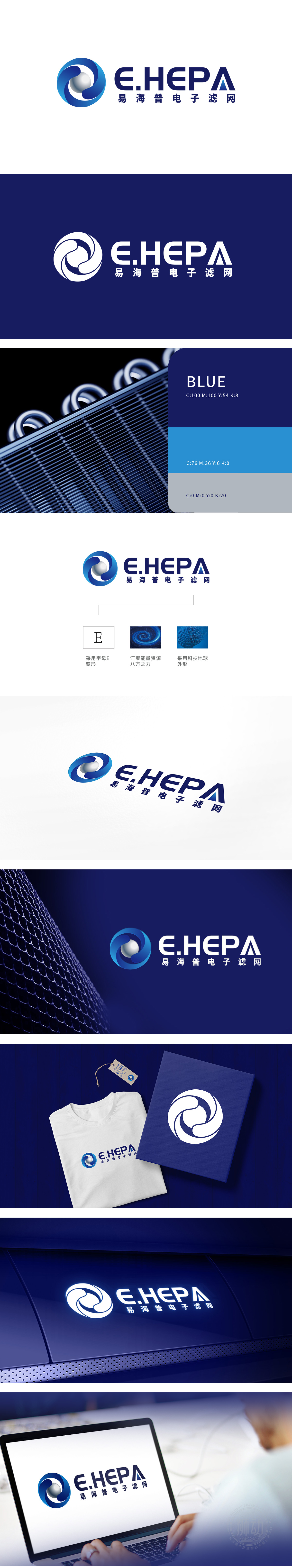
狮动设计以首字母“E”为基础进行几何化变形:外环由两个对称的蓝色弧形构成闭环,线条坚韧、流畅,既保留了“E”的识别性,又通过曲线与直线的结合,传递出重工机械行业特有的精密感与结构稳定性。弧形线条类似机械齿轮的啮合轨迹,隐喻“电子滤网”产品的核心功能,体现重工领域对“精准度”和“耐用性”的极致追求。球体被蓝色“能量环”环绕,象征滤网设备对“能量/资源”的集中处理与高效转化,呼应“汇聚能量资源,八方之力”的设计理念。通过“机械结构+能量汇聚”的抽象表达,赋予品牌重工行业特有的力量感与技术权威感,体现重工企业“立足本土、服务全球”的格局。
Lion Design carries out geometric deformation based on the initial letter "E": the outer ring consists of two symmetrical blue arcs, and the lines are tough and smooth, which not only retains the recognition of "E", but also conveys the unique precision and structural stability of heavy machinery industry through the combination of curves and straight lines. The arc line is similar to the meshing track of mechanical gears, which symbolizes the core function of "electronic filter" products and embodies the ultimate pursuit of "accuracy" and "durability" in heavy industry. The sphere is surrounded by a blue "energy ring".


扫码或拨打添加客服微信


