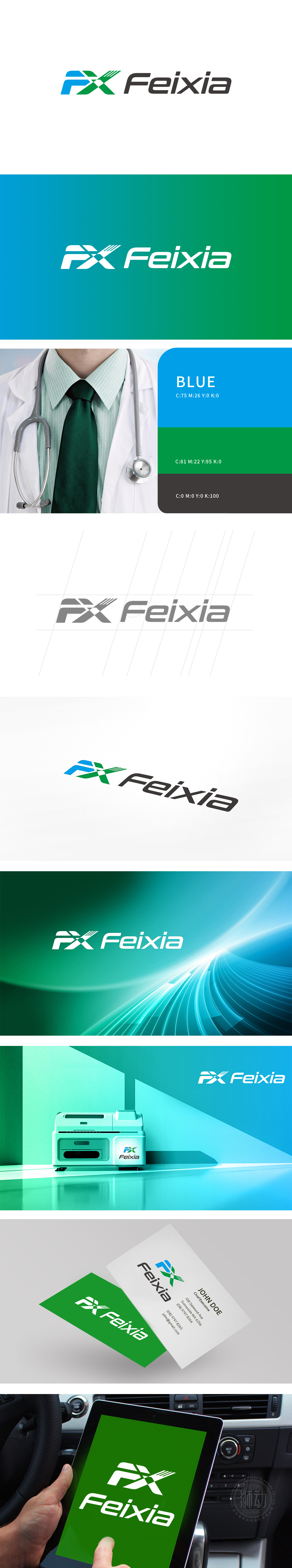
狮动设计以“F”“X”为核心,蓝色“F”:形似展翅的飞鸟或流动的波形,传递轻盈、动态感,隐喻“飞”(Fei)的品牌联想,同时蓝色在医疗领域常关联“专业、信任、科技感”。绿色“X”:以交叉的直线与“F”的曲线形成对比,“X”既是字母符号,也可联想为医疗行业经典的“十字”变体,绿色则象征“生命、健康、可持续”,贴合医疗器材对“安全、自然”的价值追求。通过 “首字母抽象化+行业色彩隐喻+现代极简美学” 的策略,成功为“Feixia”打造了兼具“精准、高效”调性品牌个性与医疗属性的LOGO。
Lion design takes "F" and "X" as the core, and the blue "F": shaped like a flying bird or a flowing wave, conveys a light and dynamic feeling, and is a metaphor for the brand association of "Fei". At the same time, blue is often associated with "professionalism, trust and scientific sense" in the medical field. Green "X": A crossed straight line contrasts with the curve of "F". "X" is not only a letter symbol, but also a classic "cross" variant in the medical industry. Green symbolizes "life, health and sustainability", which fits the value pursuit of "safety and nature" for medical equipment. Through the strategy of "abstract initials+industry color metaphor+modern minimalist aesthetics".


扫码或拨打添加客服微信


