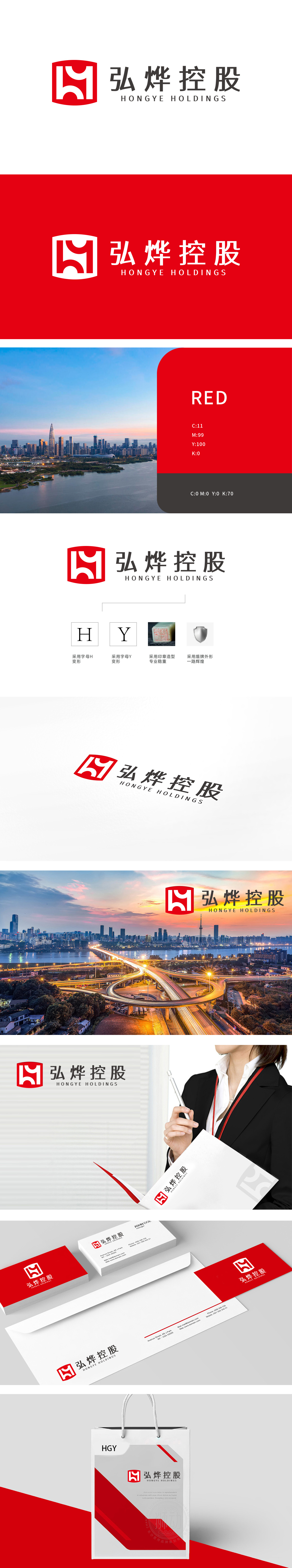
狮动设计由“弘烨”拼音首字母“H”和“Y”变形重构,H以流畅曲线贯穿上下,Y以锐角结构嵌入右侧,形成紧凑的整体符号,辨识度高,又通过线条的穿插体现“综合型企业”的多元协同与连接能力。盾牌外形:盾牌象征“守护、安全、一路辉煌”,传递企业稳健可靠的形象,契合控股公司对旗下业务的支撑与保障属性。 以视觉冲击力铸就实力符号,用设计语言诠释控股企业的行业高度。
Lion Design is reconstructed by the deformation of the initials "H" and "Y" of Hongye pinyin. H runs through the top and bottom with a smooth curve, and Y is embedded in the right side with an acute angle structure, forming a compact overall symbol with high recognition, and it also reflects the multi-dimensional cooperation and connection ability of "comprehensive enterprise" through the interpenetration of lines. Shield shape: the shield symbolizes "guarding, safety and brilliance all the way".


扫码或拨打添加客服微信


