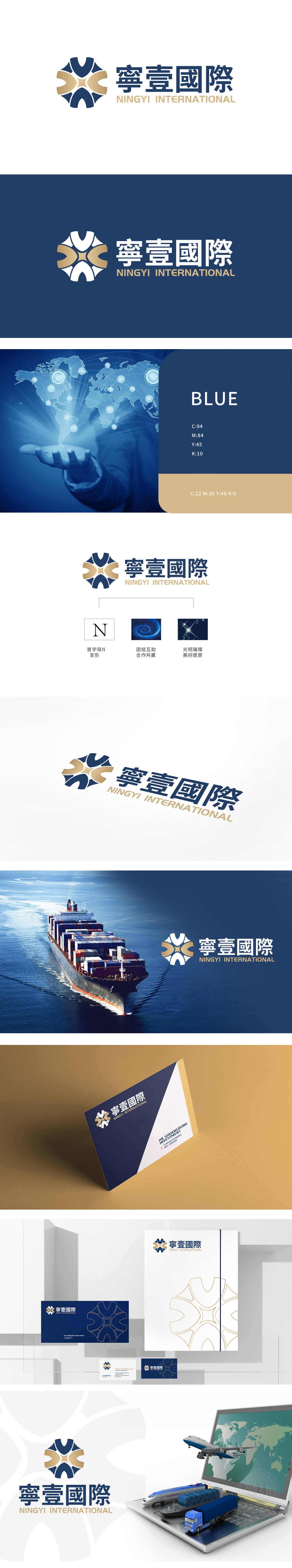
狮动设计通过以“寧”字首字母“N”为骨架,每一条线条都在这里交汇,每一件货物都在这里找到方向,同时用“汇聚的结构”诠释物流的“连接本质”,把物流的**“流动之魂”与“连接之美”,做成了最有冲击力的视觉宣言:把物流的“功能性”与“情感性”,变成了可视觉化的“价值共鸣”。“寧壹國際”的标志,用设计告诉我们:物流不是“搬运货物”,而是“连接每一个需要的人,传递每一份未说出口的期待”。
Lion Design takes the initial letter "N" of "Ning" as the skeleton, where every line meets and every goods find their direction. At the same time, it interprets the "connection essence" of logistics with "convergent structure", making the * * "flowing soul" and "beauty of connection" of logistics into the most impactful visual declaration: to combine the "functionality" and "beauty of connection" of logistics. The logo of "Ningyi International" tells us by design that logistics is not "carrying goods", but "connecting everyone who needs it and conveying every unspoken expectation".


扫码或拨打添加客服微信


