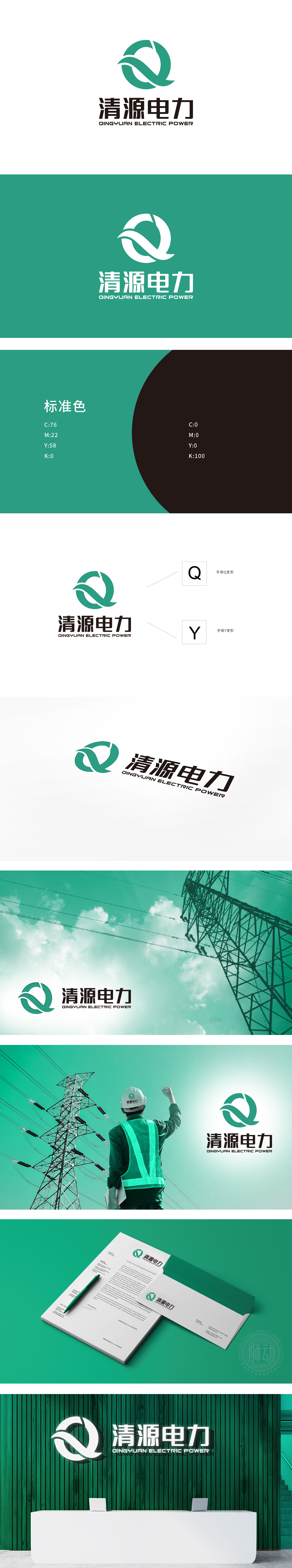
狮动设计以“字母Q+环形+飘带”为核心组合,每一个元素都对应公司的“身份标签”:字母Q:首字母,是品牌的“视觉基因”,环形:象征“循环、可持续”,直接关联电力行业的“能量循环”,尤其贴合“清洁能源”的理念;飘带/流线:穿过环形的飘带,既模拟了“电力传输的线路”,又传递“能量流动”的动感,打破环形的沉闷,让LOGO更具“生命力”。
Lion design takes the letter Q+ ring+ribbon as the core combination, and each element corresponds to the company's "identity tag": the letter Q, the initials, is the brand's "visual gene", and the ring, the symbol of "cycle and sustainability", is directly related to the "energy cycle" of the power industry, especially the concept of "clean energy"; Ribbon/Streamline: Passing through the circular ribbon not only simulates the "power transmission line".


扫码或拨打添加客服微信


