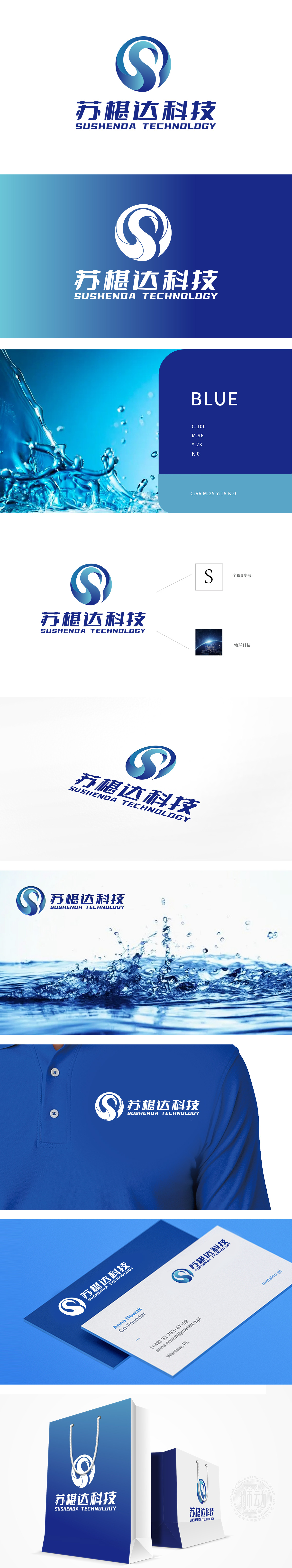
狮动设计以首字母“S”为创意原点,将直线条简化为流动的曲线——既像蜿蜒的河流、浮动的云团,又似缠绕的能量场。蓝白渐变的色彩搭配,不仅模拟了自然景观的层次感,更通过“水”“气”这些自然基础元素,暗合“环保”的核心主题,这种“字母+自然形态”的变形,会自然联想到自然的生机;看到圆形地球时,会联想到科技对地球的守护——这种“润物细无声”的理念传达,正是设计能力的最高境界:用视觉语言让品牌与用户产生情感共鸣。
Lion design takes the initial letter "S" as the creative origin, and simplifies the straight line into a flowing curve-like a winding river, floating clouds and a winding energy field. The gradual color matching of blue and white not only simulates the layering of natural landscape, but also coincides with the core theme of "environmental protection" through the natural basic elements of "water" and "gas". This deformation of "letter+natural form" will naturally associate with natural vitality.


扫码或拨打添加客服微信


