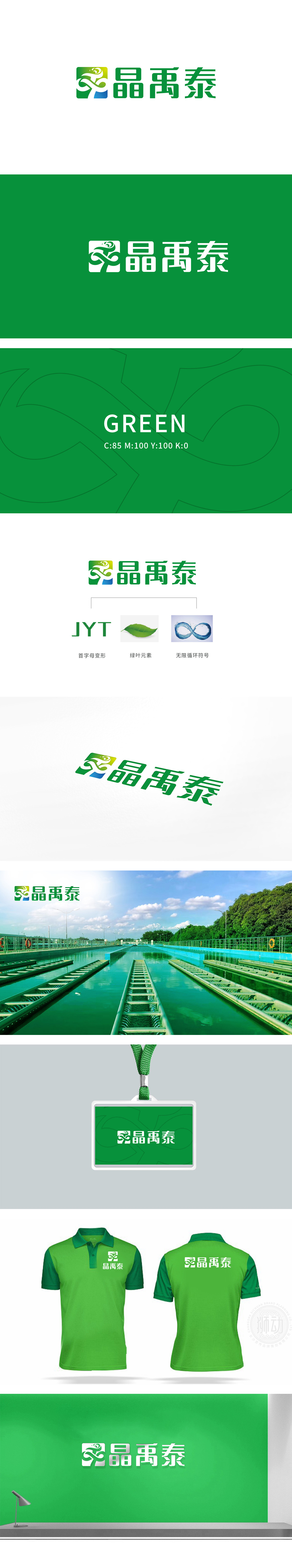
狮动设计采用“森林绿”与“JYT绿”形成“色调统一”;这种“视觉重复”让整个LOGO体系更具“记忆点”,也能快速关联到“晶禹泰”品牌。文化符号的“软植入”:“禹”作为“治水圣人”的文化IP,被巧妙融入LOGO设计,既赋予品牌“历史厚重感”,又让“水资源保护”的主题有了“文化共鸣点”,无限循环符号的“水流形态”、绿叶,都在暗示品牌的“业务场景”,更强调“专业的水资源管理”。整体设计把“环保”从“口号”变成了“能触摸的温度”,把“品牌”从“名字”变成了“有故事的生命体”。
Lion design adopts "forest green" and "JYT green" to form "unified tone"; This "visual repetition" makes the whole LOGO system more "memorable" and can also be quickly associated with the "Jingyutai" brand. Soft implantation of cultural symbols: Yu, as the cultural IP of "the sage of water control", is skillfully integrated into the LOGO design, which not only gives the brand a sense of history, but also gives the theme of "water resources protection" a cultural resonance point. The "water flow pattern" and green leaves of the infinite circulation symbols all imply the brand's .


扫码或拨打添加客服微信


