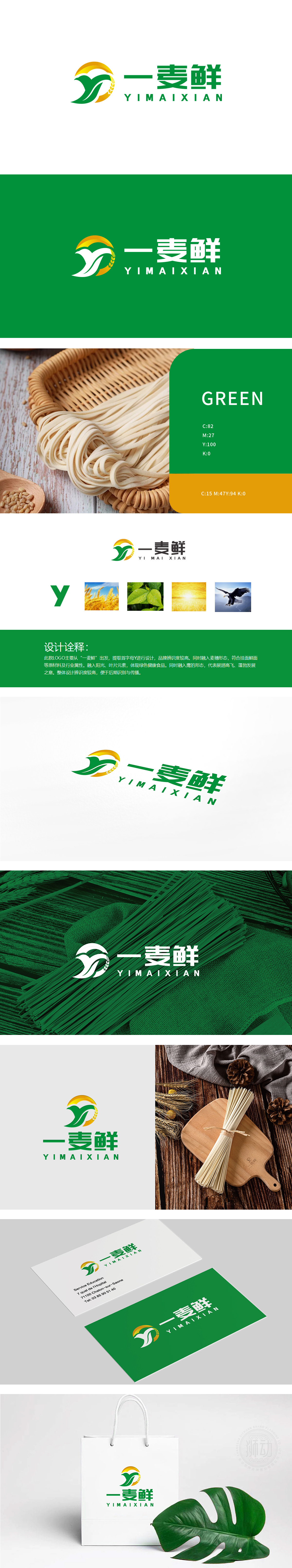
狮动设计以品牌首字母“Y”为骨架,将“麦穗”形态融入“Y”的结构——左侧的绿色“Y”竖线抽象为麦秆,一眼便让人联想到挂面的核心原料“小麦”。呼应传统工艺感:麦穗的形态自带“天然、朴实”的属性,契合挂面“手工感、家的味道”的消费联想,色彩的“食品感”:绿色(健康)与黄色(阳光/麦香)的搭配,(绿色代表天然,黄色代表麦香浓郁)是“好挂面”的色彩认知,“一麦鲜”的“麦”字通过麦穗形态可视化,“鲜”字则通过阳光、叶片传递“新鲜”,让品牌名与LOGO形成“文字-图形”的双重记忆。
Lion design takes the brand initials "Y" as the skeleton, and integrates the shape of "wheat ear" into the structure of "Y"-the green "Y" vertical line on the left is abstracted as wheat straw, which makes people think of the core raw material of dried noodles at a glance. Echoing the traditional sense of craftsmanship: the shape of wheat ears has its own "natural and simple" attribute, which is in line with the consumption association of vermicelli with "handmade feeling and home taste"; the "food feeling" of color is the combination of green (healthy) and yellow.


扫码或拨打添加客服微信


