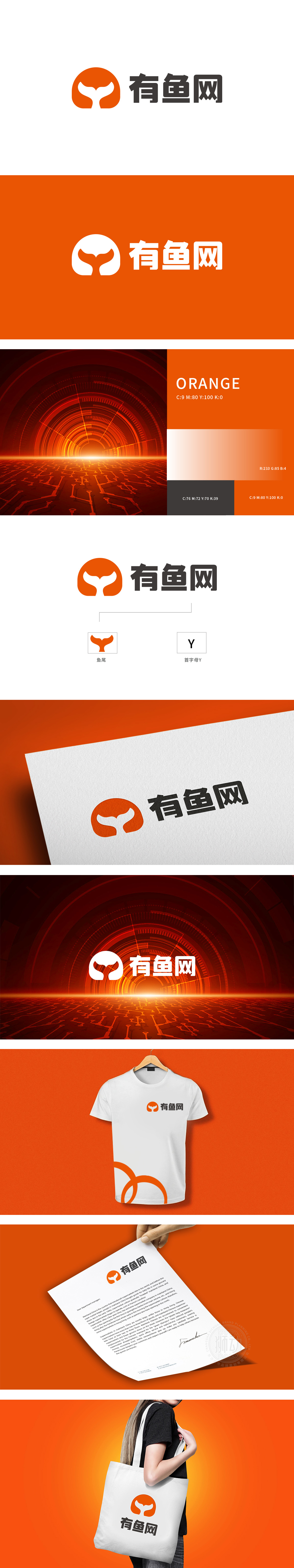
狮动设计以橙色圆形为基底,内嵌白色鱼尾轮廓,形成强烈的视觉焦点。圆形无边界、无棱角的特性,象征平台的开放性(连接用户、资源、信息);同时,闭合的轮廓暗示“完整服务链路,白色鱼尾以向上扬起的动态线条打破圆形的静态感,恰似“数据流动”“用户活跃”的互联网特征:鱼尾的摆动感既象征平台上的“内容/商品流动”,也隐喻用户在平台上的“交互行为。有鱼网”的标志以“符号即战略”的设计逻辑,将“鱼”的核心意象与互联网平台的“连接、聚合、活力”属性深度绑定,用极简图形构建出极具穿透力的品牌记忆点。
Lion design is based on orange circle and embedded with white fishtail outline, forming a strong visual focus. The circular shape is borderless and angular, which symbolizes the openness of the platform (connecting users, resources and information); At the same time, the closed outline implies a "complete service link", and the white fishtail breaks the circular static feeling with a dynamic line that rises upwards, just like the Internet characteristics of "data flow" and "active users": the swinging motion of fishtail not only symbolizes the "content/commodity flow" on the platform.


扫码或拨打添加客服微信


