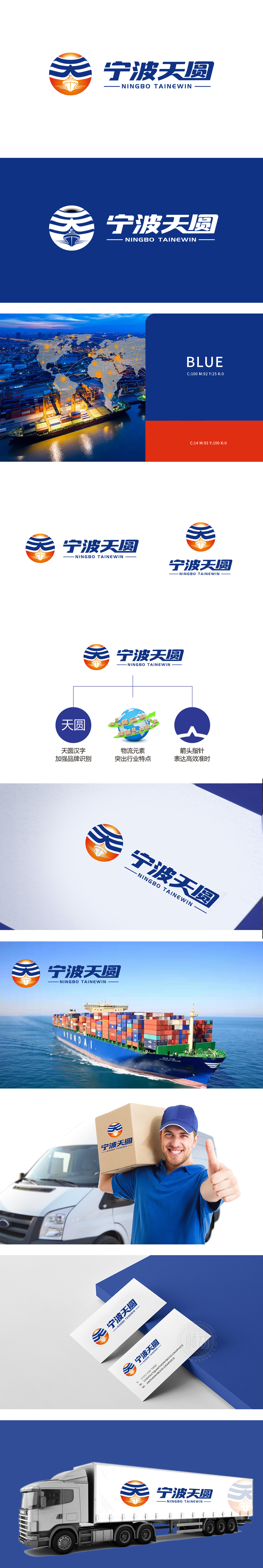
狮动设计以“橙色太阳+蓝色波浪+帆船”为核心,既呼应“天圆”的“圆”形意象,又通过帆船和波浪直接关联海运物流的行业基因,橙色象征活力与全球视野,蓝色传达专业与可靠,视觉上形成强烈的记忆点。直接使用“天圆”汉字作为视觉符号,搭配深蓝底色的圆形载体,既符合中文品牌的识别习惯,又通过色彩与形状的统一性,快速建立“天圆”与物流服务的强关联,降低品牌传播成本。整体以蓝、白、橙为主色调,蓝色(专业、信任)+ 橙色(活力、全球)符合物流行业的稳重属性,形成“品牌名→核心价值→行业特性”的递进关系,信息传递层次分明,直观易懂。
Lion design takes "orange sun+blue waves+sailboat" as the core, which not only echoes the "round" image of "the sky is round", but also directly relates to the industry genes of marine logistics through sailboats and waves. Orange symbolizes vitality and global vision, and blue conveys professionalism and reliability, forming a strong memory point visually. The direct use of "Tianyuan" Chinese characters as a visual symbol with a circular carrier with a dark blue background not only conforms to the recognition habit of Chinese brands, but also quickly establishes a strong connection between "Tianyuan" and logistics services through the unity of color and shape, reducing the cost of brand communication.


扫码或拨打添加客服微信


