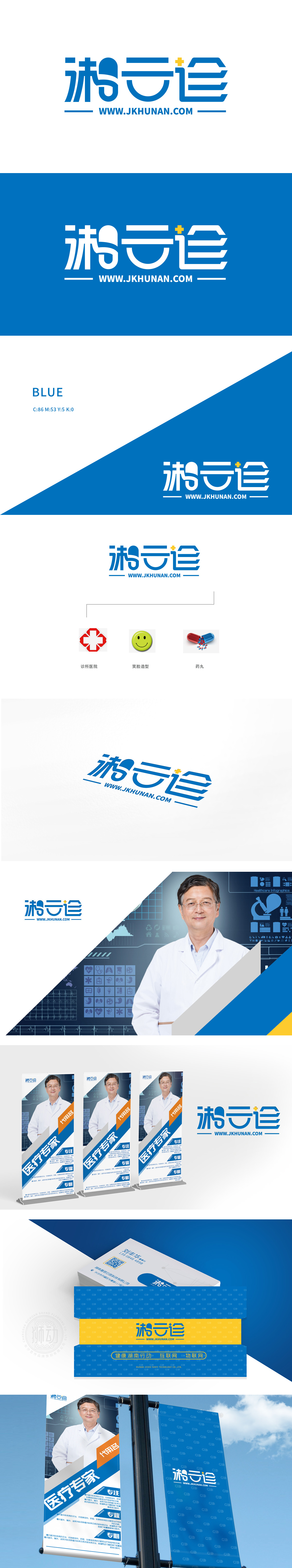
狮动设计以"湘”明确指向湖南地域,“云诊”则直观体现互联网医疗的核心业务模式,名称简洁且具有行业辨识度,融入笑脸传递温暖、安心的情感,弱化医疗场景的紧张感,体现“以患者为中心”的人文关怀,符合医疗服务中“舒适体验”的需求。整体设计从“行业”到“情感(笑脸)”再到“产品(药丸)”,图标组合覆盖了医疗服务的“硬件(机构)-软件(体验)-核心产品(药品)”全链条,逻辑闭环完整,让用户快速感知服务价值。
Lion design clearly points to Hunan, and the cloud diagnosis directly reflects the core business model of Internet medical service. Its name is concise and has industry recognition, and it is integrated with smiling faces to convey warm and reassuring feelings, weaken the tension of medical scenes, reflect the humanistic care of "patient-centered" and meet the needs of "comfortable experience" in medical services. The overall design is from "industry" to "emotion (smiling face)" and then to "product (pill)".


扫码或拨打添加客服微信


