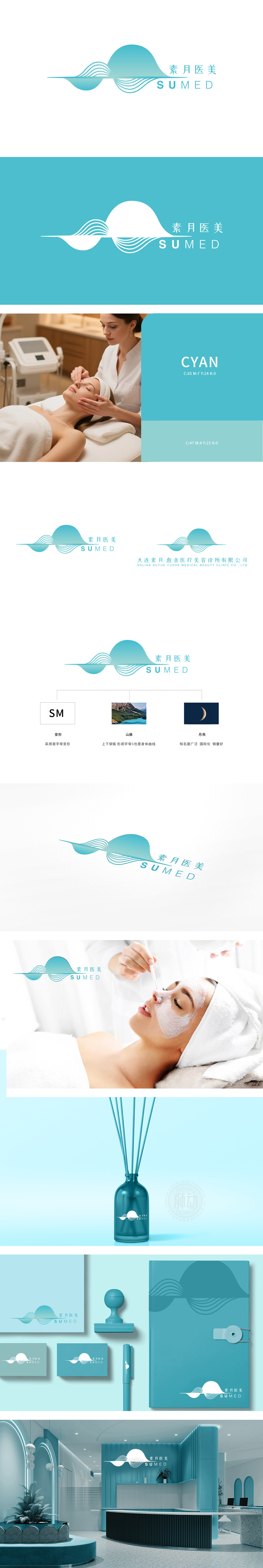
狮动设计以首字母变形与身体美学的融合,logo主体以“素月医美”首字母“SM”为创意原点,通过流畅的曲线变形,将“M”的结构与“身体曲线”(S形)巧妙结合。上下穿插的线条既似山峦起伏的自然韵律,又暗喻女性身体的柔美线条,精准传递医美行业对“健康曲线”“自然塑形”的追求,更显温婉与艺术感。“月”元素的文化与商业价值叠加 ,传递医美服务“安全、持久、自然”的承诺;整体采用柔和的蓝绿色系,传递“源于自然、回归本真”的医美理念,构建“安全、纯净、高端”的品牌气质。
Lion design is based on the combination of initial deformation and body aesthetics. The main body of logo takes the initial "SM" as the creative origin, and skillfully combines the structure of "M" with "body curve" (S-shape) through smooth curve deformation. The lines interspersed up and down are not only like the natural rhythm of the ups and downs of mountains, but also metaphor for the feminine lines of women's bodies, accurately conveying the pursuit of "healthy curve" and "natural shaping" in the medical and beauty industry, and showing a gentle and artistic sense. The cultural and commercial value of the "Moon" element is superimposed, conveying the promise of "safety, durability and naturalness" in medical beauty service.


扫码或拨打添加客服微信


